Demographics

School Coordinator
They manage the inventory and itinerary of the school, and manage multiple internal stakeholders making sure everything is up to date.

Parents
Time-poor and multi-tasking, the parent needs to have simple and clear directions often with children going to different schools.

Children
Not a user of the platform, but the recipient of it. If the platform fails to perform they will be negatively affected.
Logo Redesign
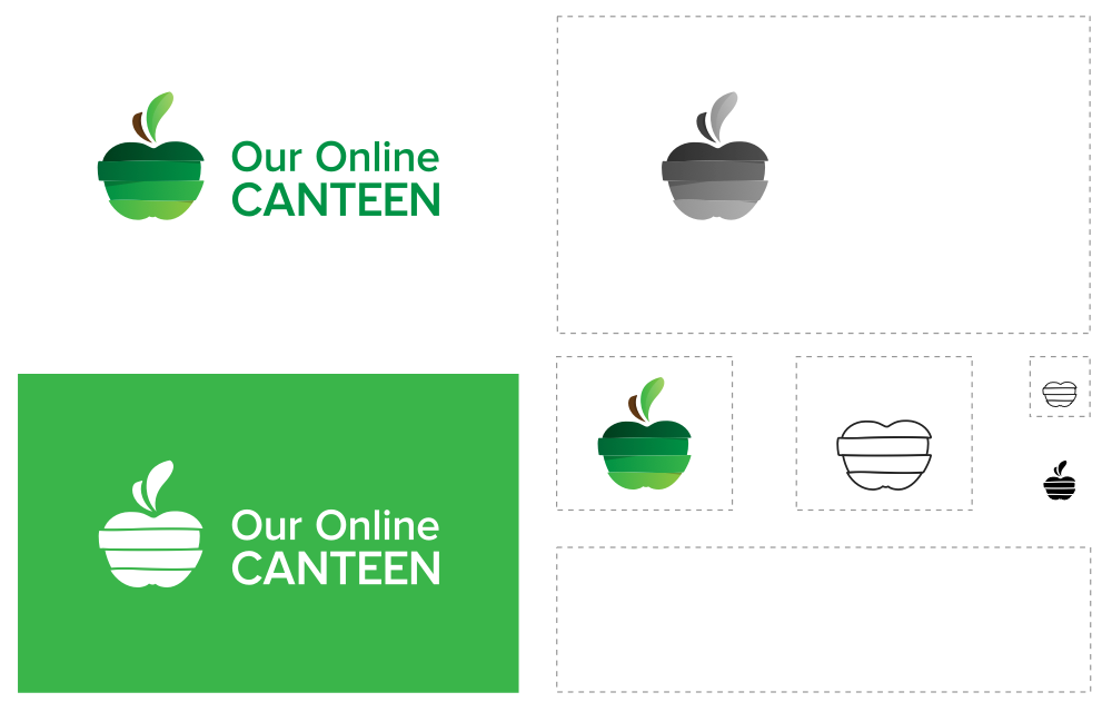
The logo desperately needed updating. We created several variations of the apple logo in the flat style with different levels of abstraction.
We had to be careful not to promote one particular facet of the business more than another. With that in mind, we landed on the segmented version and the client also felt it reflected this.
Style Guide
Imagery
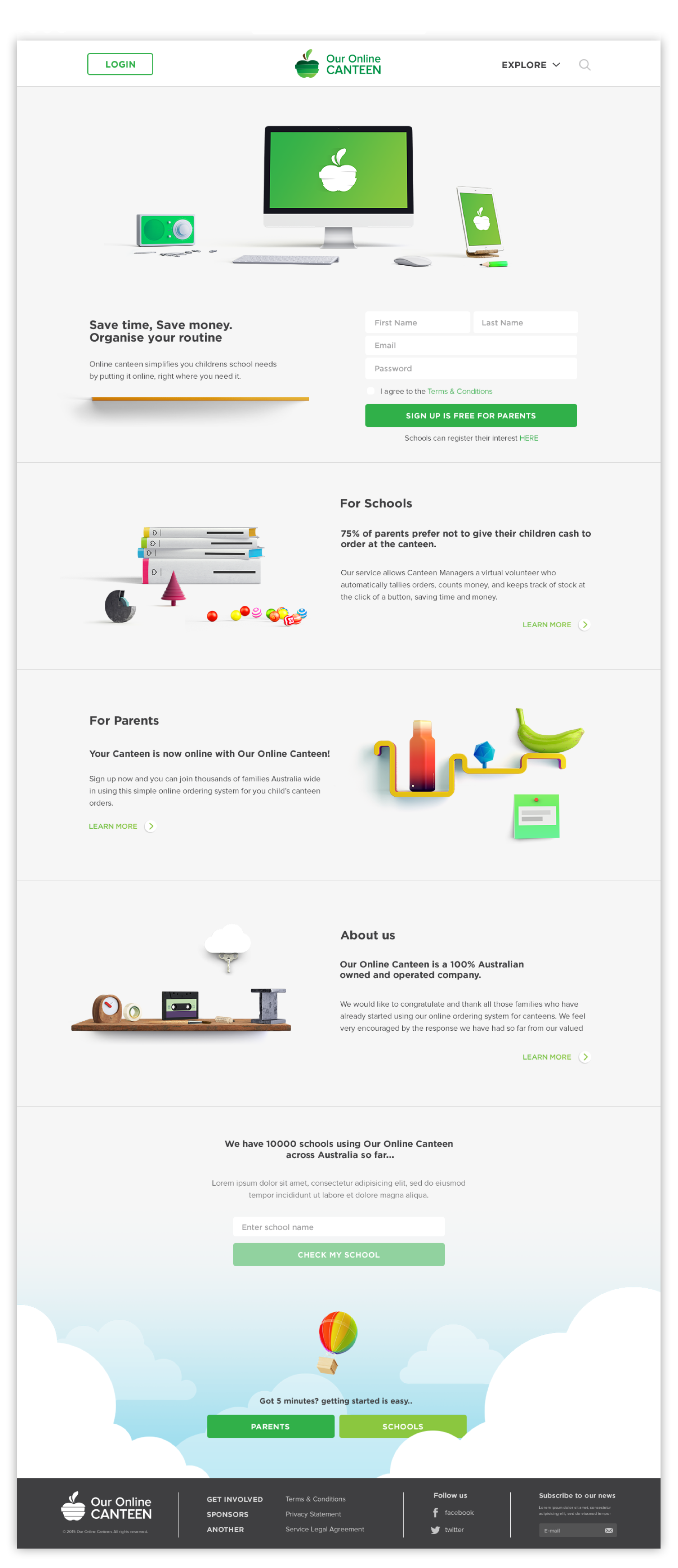
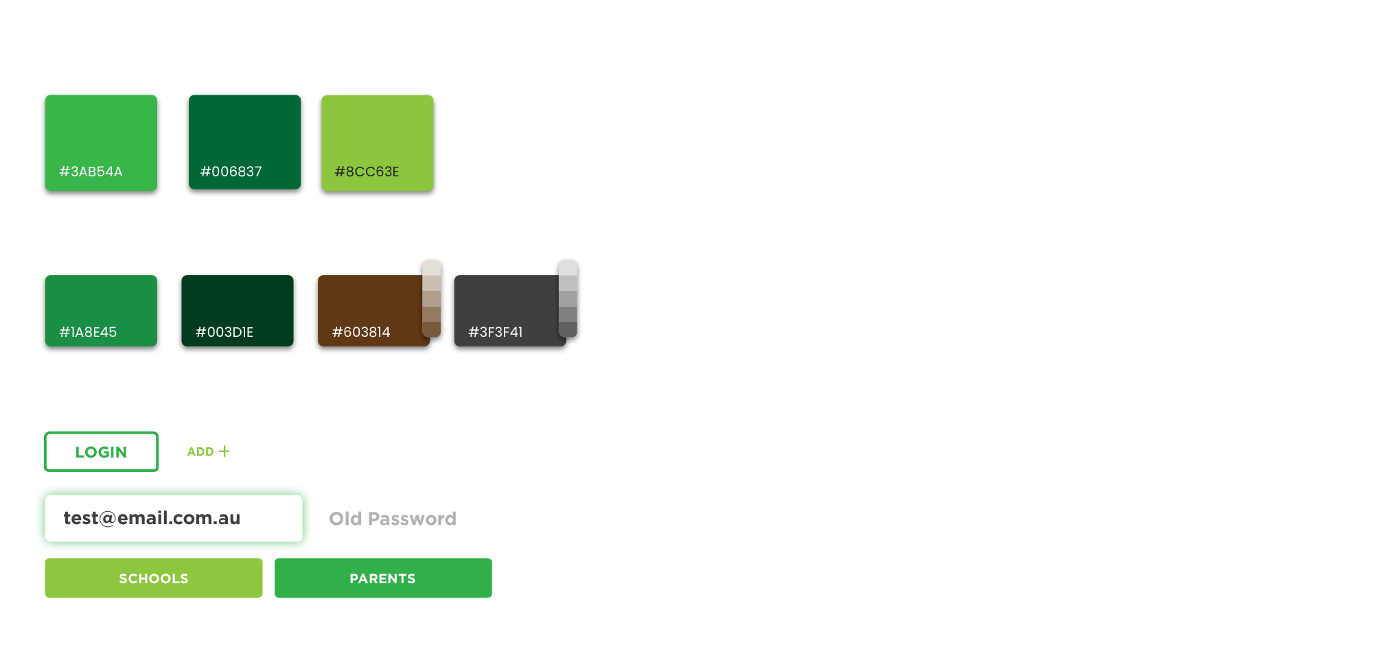
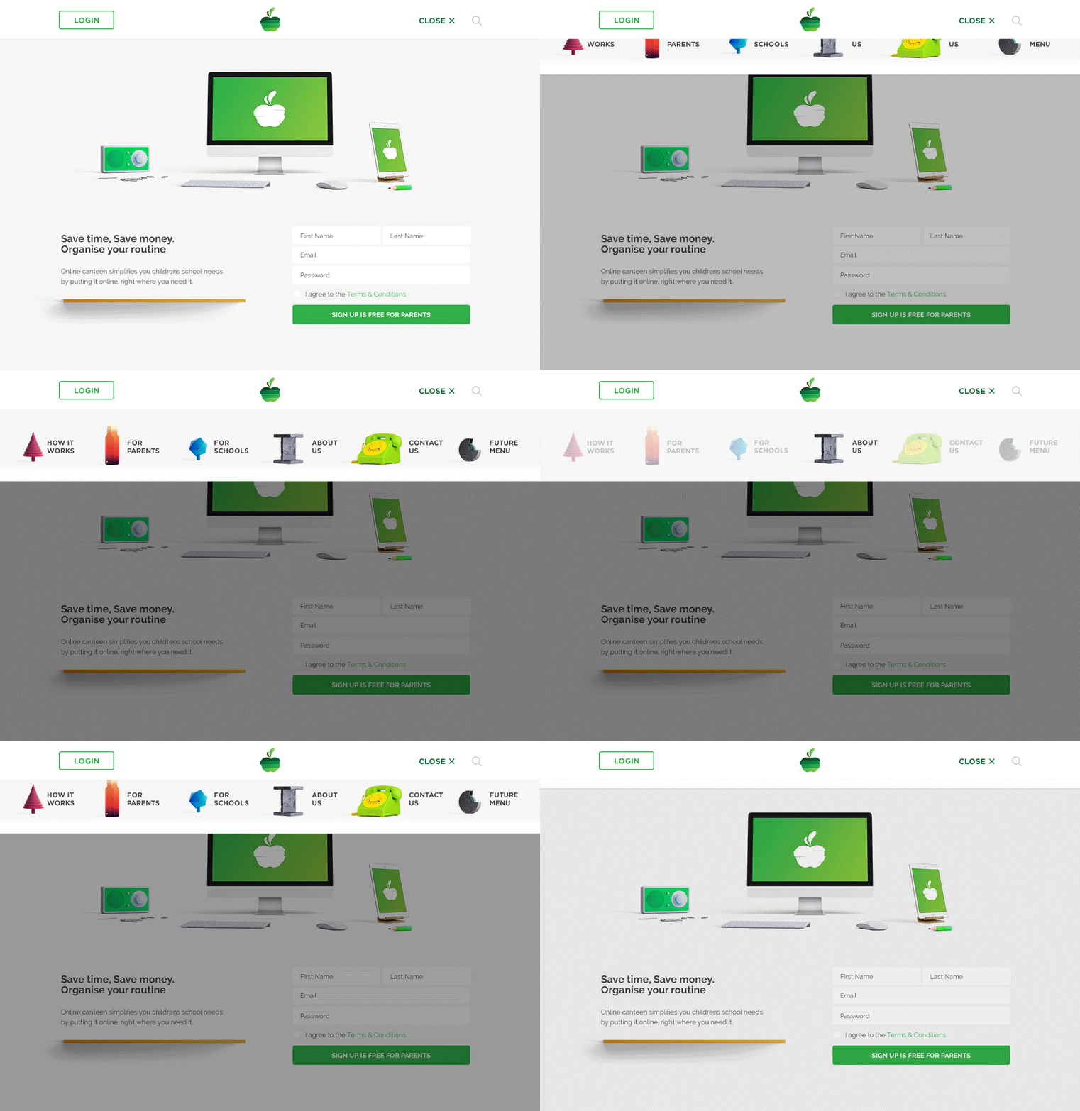
The imagery offset text forms and blocks and acted as a navigational / contextualization tool. The colours for each image were modified to unify the page.
They could be combined, placed on shelves and overlapped to marry the content it was next to visually.

Web design


Information Architecture
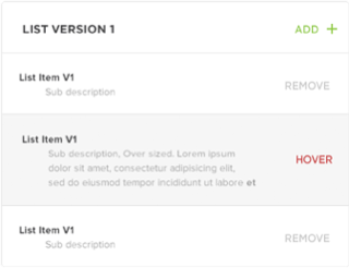
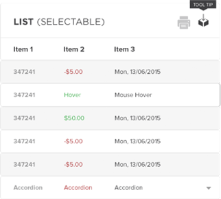
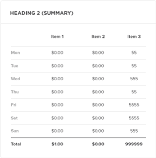
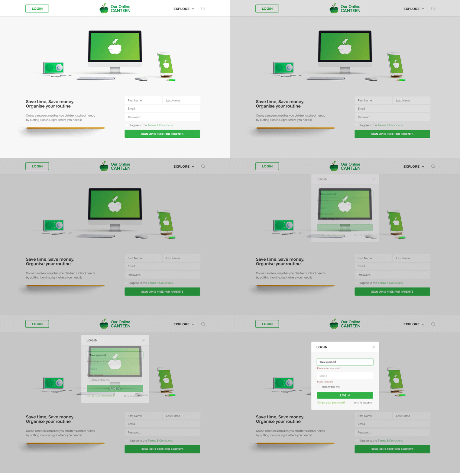
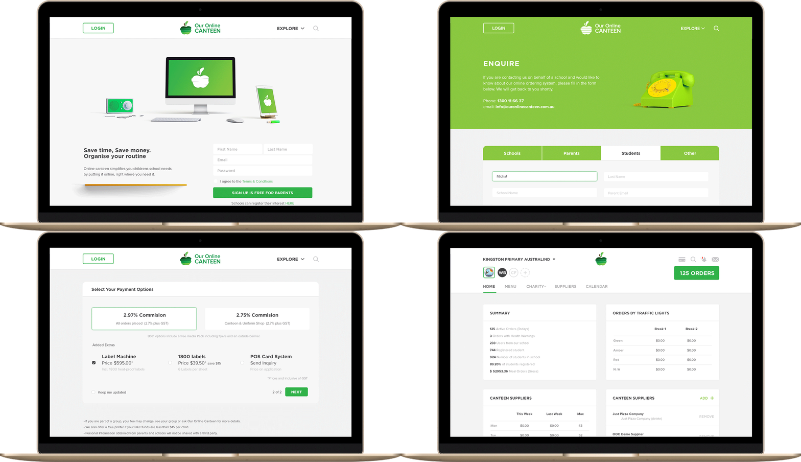
Our online canteen internal screens have a school end and a family end both with multiple users. Correlating UI elements between each version is the simplest way to meet both objectives.
Interface Design
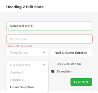
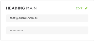
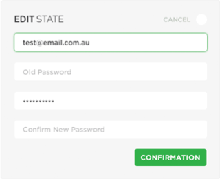
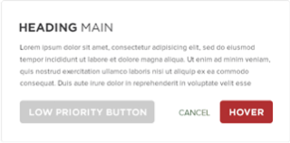
With the Online Canteen interface, we prioritised clarity and legibility – the primary use case is to be functional.
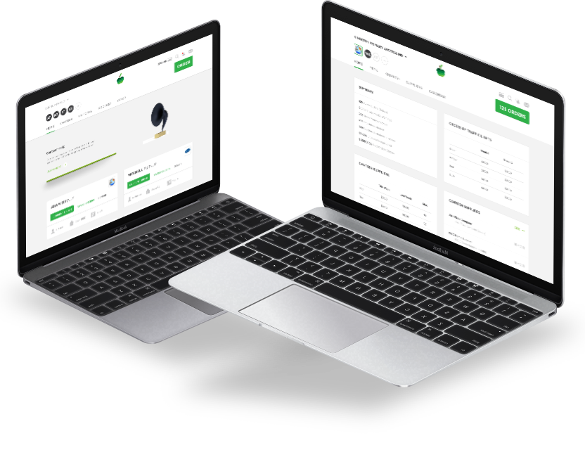
We also made the website and management areas fully responsive down to mobile, although we saw that currently it was primarily used on desktop.
Final Outcome
The final result is easy to use and has an interface that can be expanded upon.
We see the design as a perfect balance of usability and user experience that should make many parents’ lives just a little bit easier.
They need as much help as they can get!
“Michael has had to collaborate with multiple stakeholders and colleagues across the business to deliver the new brand/website/ iconography and associated materials in advance of the launch. TOP work Michael!
Jarred Marks – Our Online Canteen
Let's see if we click 👉
We have experience at every level and stage. Talk to us about strapping a rocket to your roadmap.

