Truphone had upped their competitive edge by building its own eSIM platform. It was no longer just a telco but a digital eSIM manufacturer.
They wanted to update their brand to reflect this to existing business customers and potential new customers (their-then competitors).
Repositioning
The brand first needed to be updated for the digital age; to have a brand mark for social profiles, favicon and the like.
Secondly, to visually encapsulate their personality and differentiate them from competitors. The vast majority of them used circle/global or letter marks.
Truphone wanted to make a statement and stand out without being misunderstood.
Logo Redesign
Functionally, the old logo could not occupy new spaces created by digital platforms making it appear smaller.
The new logo made a grab for a SIM card-like mark, that incorporated the “T” while still using the ubiquitous organic shapes prevalent in the sector.
The design combines clean organic curves with prominent geometric shapes.
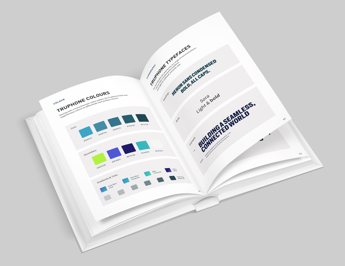
Branding
Knowing the monochromatic base colour would be insufficient, we decided to claim another element yet to exist in the telco sector: Lime.
Not appropriate for the brand, this was used for CTAs and a base to generate gradients that would distinguish each product offering.
Bold, Heron Sans heading to match the logo were paired with a subtler Sora “light” to make copy readable.
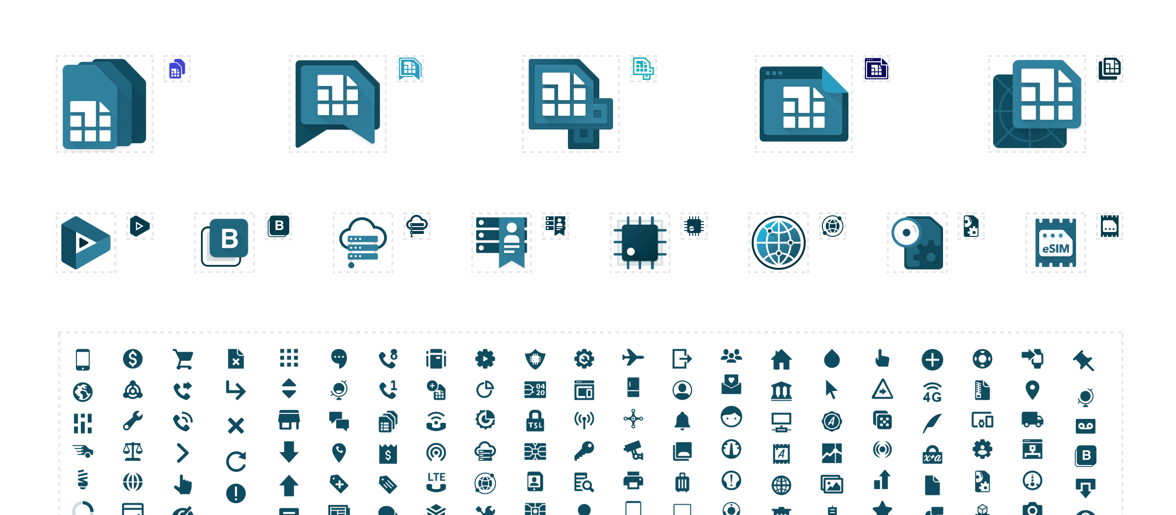
Iconography
With so much to offer in multiple verticals, it was necessary to craft bespoke icons.
3 Tiers: Product, Technology, and UI (Glyph). All of which could be colour-coded and scaled to 24px as web-native SVGs.
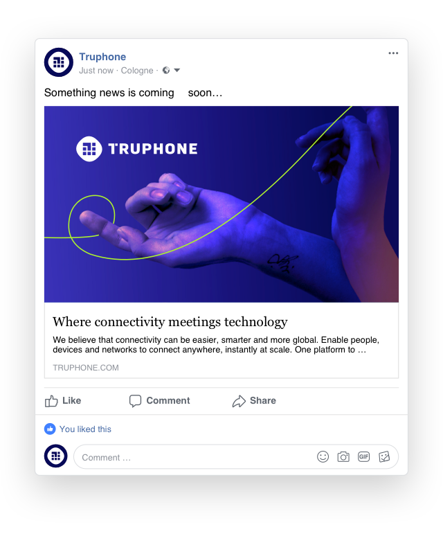
Consistent on all touchpoints
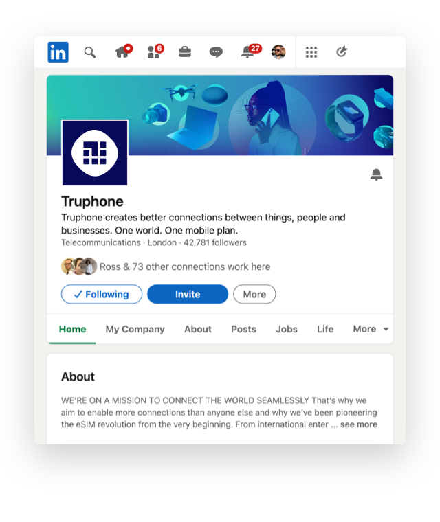
From socials, to website, physical locations, stationary, and showing booths, the brand was cohesively applied to great effect. Truphone saw a substantial increase in interest from new and existing customers, as well as an overall increase in traffic.
Making a statement
Bold, brave, and loud. The Truphone website now embodies its company’s values and will attract like-minded customers.
“We are not your standard telco; in product, mindset, or capability. This is the future.”
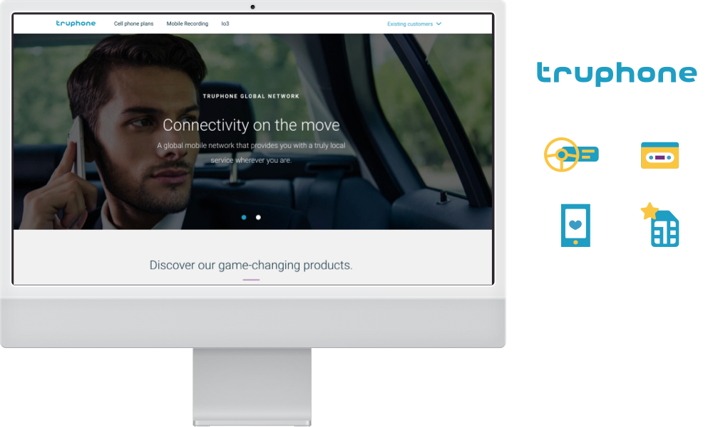
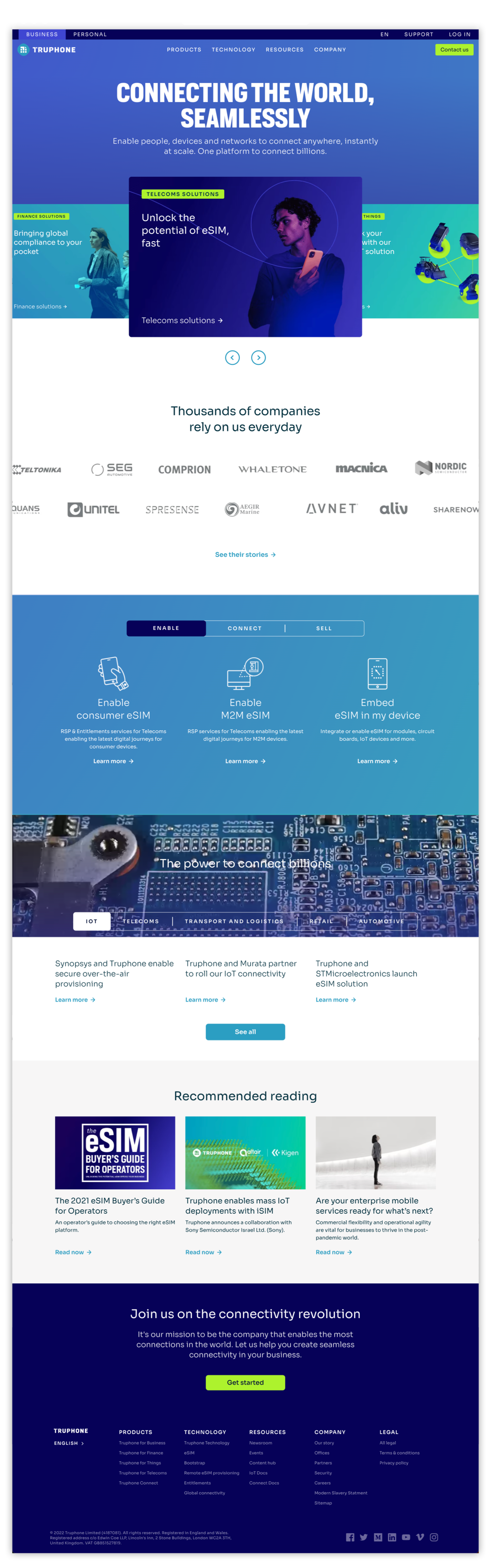
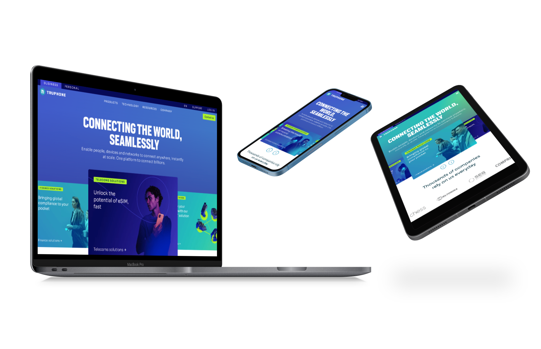
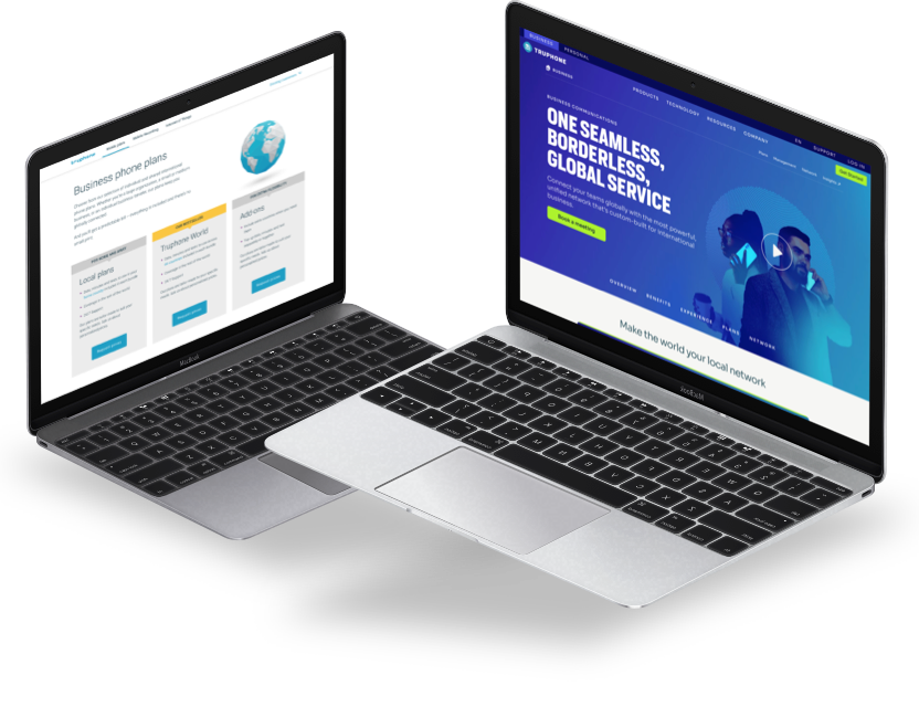
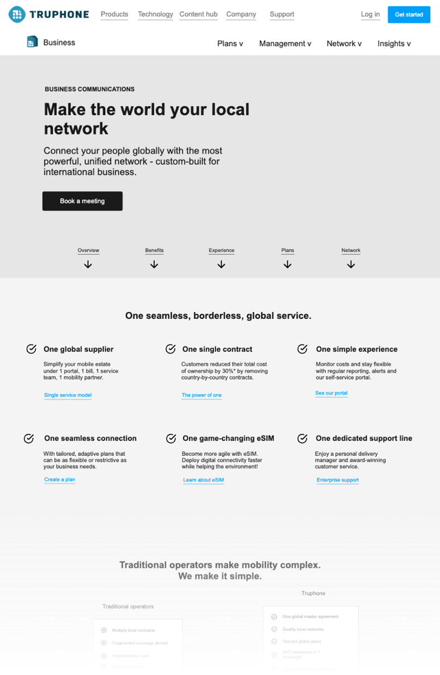
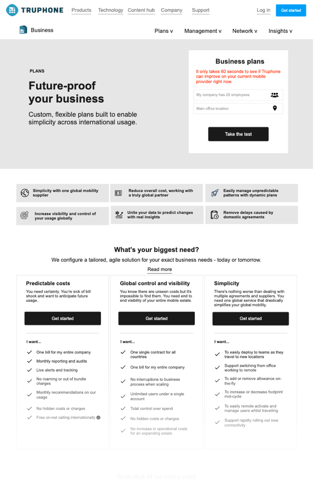
Website Design
The website was completely redesigned in under 3 months. Built on a custom CMS it used the latest tech for speed and experience; reaching a 99% ranking on Google PageSpeed insights!
For the sake of brevity, we will focus on the redesign of business mobile plans.
Business mobile
Truphone was competing like-for-like with their competition, focusing on price and network quality.
After conducting research we realised that their customers were not saving on price, but efficiency. This gave us a clear starting point.
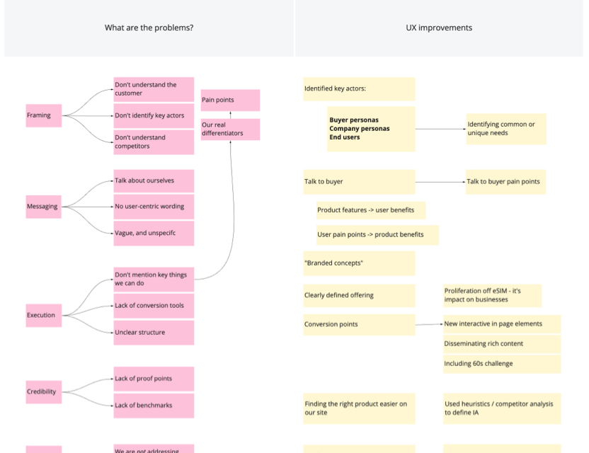
Problem Statement
We defined our key problems and brainstormed potential solutions to address them.
We needed to learn more about why their current users actually like them, and make sure the execution reflected this from graphics, to messaging and choice of content.
The ultimate goal still being “Talk to us.”
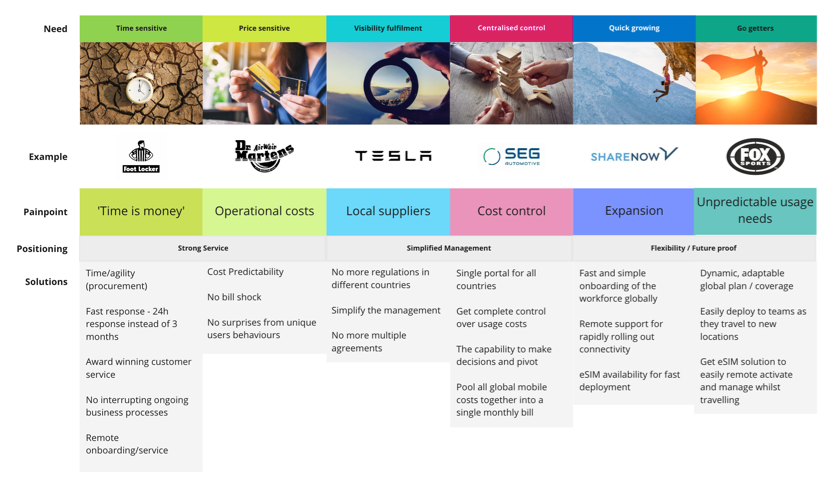
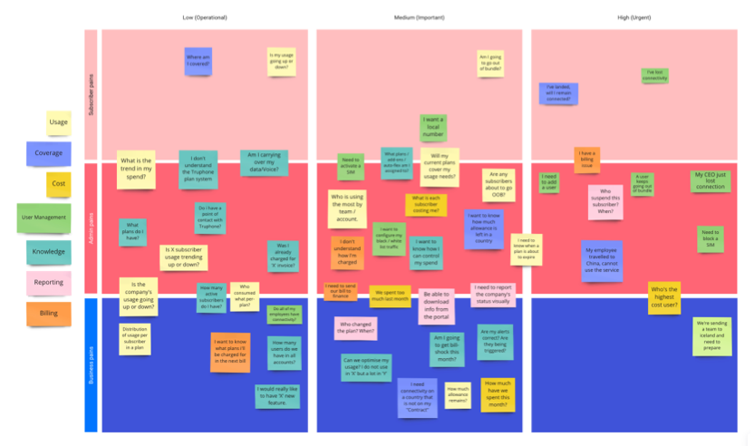
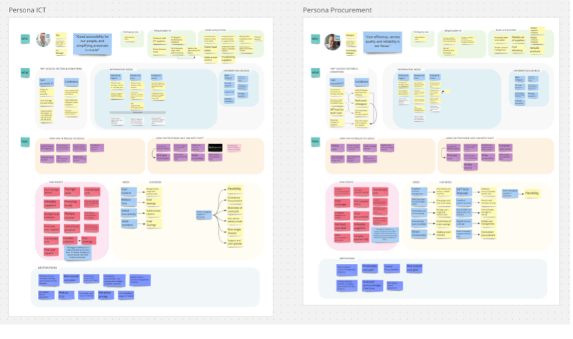
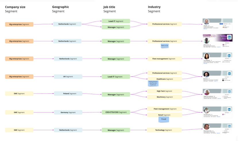
Defining the customer
After conducting future research we created:
1 – User pain-point map 2 – Market Segmentation 3 – Buyer Personas 4 – Persona Archetypes
Creating a sharable document that clearly articulated the types of customers that would benefit from Truphone and their needs.
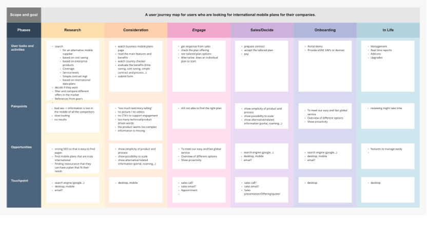
User Journey
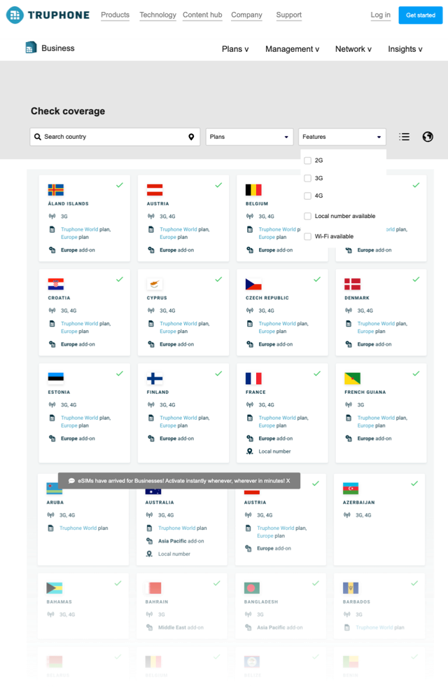
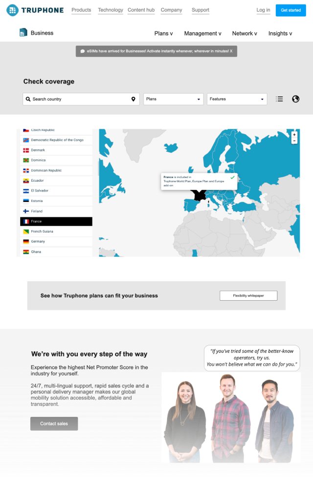
Mapping the user journey from discovery to acquisition to retention is key to understanding what information needs to be shown and when.
If a customer is looking for how to install an eSIM and finds coverage, this will cause friction.
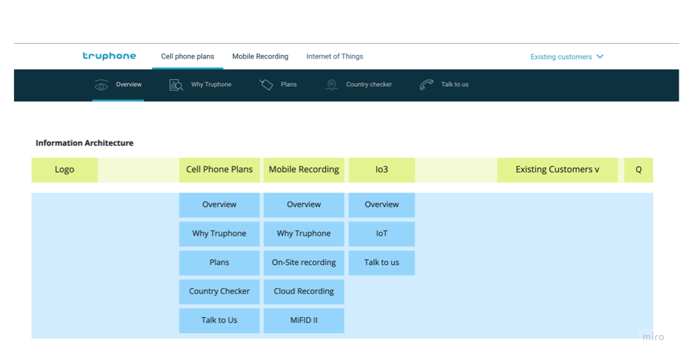
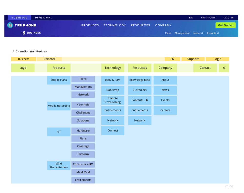
A Clear vision
The introduction of numerous additional offerings including; a new consumer offering, eSIM solutions and enhanced IoT, overloaded the existing menu.
Not to mention the existing customers were struggling to find clear lines of escalation for support.
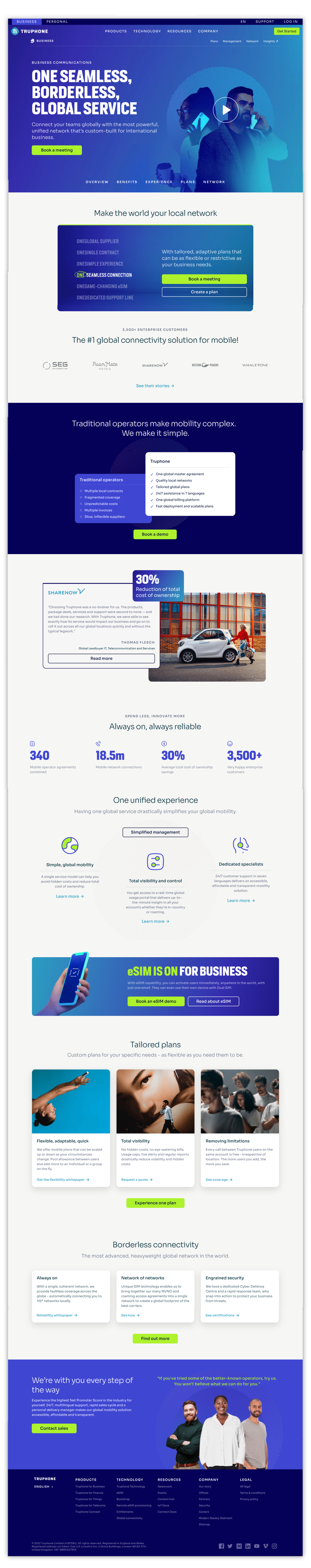
We implemented a 3-tiered mega menu, and enhanced the primary CTA, while redefining the labels to better reflect the content within.
Wireframes
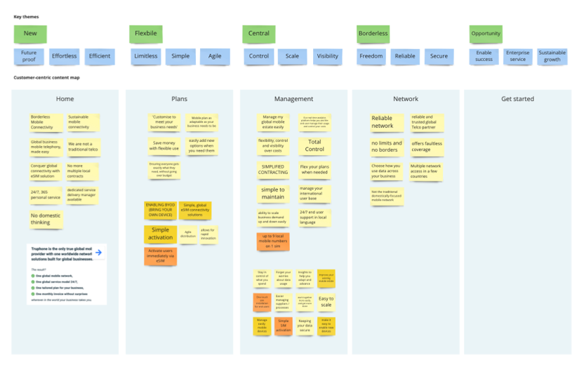
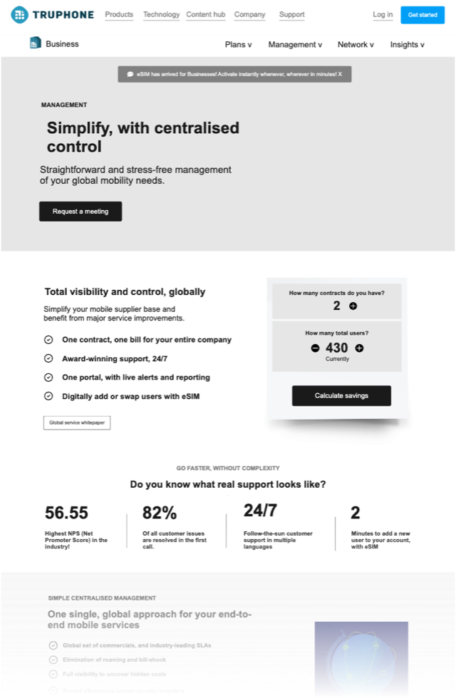
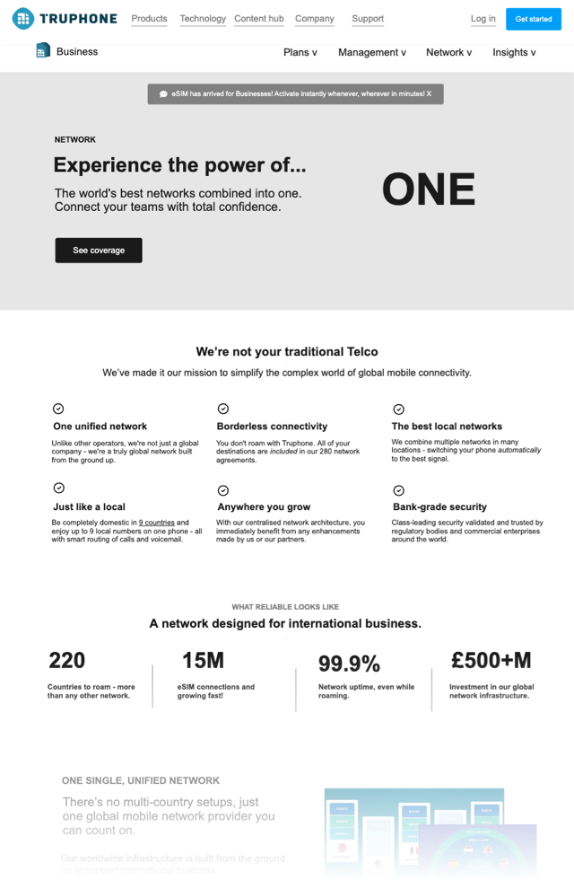
Each page was created under a topic, but it was also paired with a consumer-centric theme; management = control/scale/visibility.
This enabled the copywriters to articulate each feature from that frame of reference (the frame of the customer).
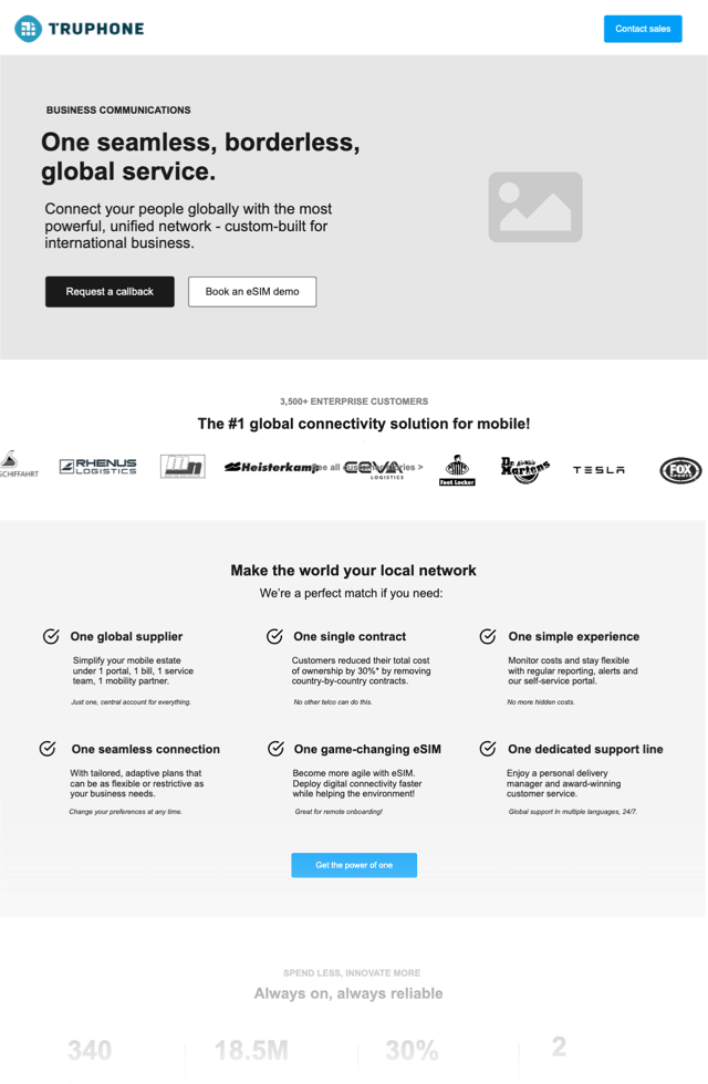
Clear, Bold, Seamless
Business mobile plans for the new era. Customers expected little from their mobile providers because the industry is archaic.
Not anymore. Truphone is as cutting-edge and ambitious as they are, making them the perfect business partner.
“Michael has a deep understanding of best practices across, UX, UI and product design and his extensive research allows him to create audience-led recommendations that bring huge value to the market.”
Guy Thornton – Truphone
Let's see if we click 👉
We have experience at every level and stage. Talk to us about strapping a rocket to your roadmap.