Demographics
My Local Savings is designed for savvy shoppers. We disregarded affluence as you can be rich and savvy (oftentimes it’s why they are rich).
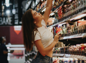
Impulse shoppers
Often buys items that they were not planning to buy, and make decisions in the heat of the moment.
Bulk shoppers
Will buy anything that doesn’t expire in bulk if they have enough space to store it. Usually families.
List shoppers
Bespoke list of targetted ingredients, needs to be directed immediately to the exact items
Vicarious shoppers
Orders items via a second party, “We need this, we need that.”
Restricted Diet
More common now. A limited selection of ingredients, and high priority on filtering.
Rewards shopper
Has one or many loyalty cards and subscribes to schemes to accrue points.
Repeat shoppers
Re-buys the same items very frequently, and hates manual operations.
Special hunters
Will make buying decisions based on what is discounted and often matches their cooking with the seasons.
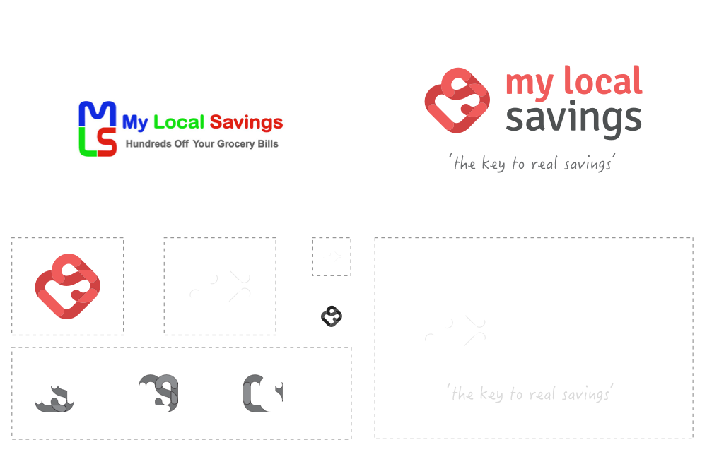
Logo Redesign
The current logo overused saturated, primary colours resulting in a brand that was difficult to read (especially at small sizes on coloured backgrounds).
We decided to use a single vivid red, demarking the “My Local” and “Savings” to help break up the length.
Style Guide
Knowing that the platform would test the limits of design, we chose Roboto for both the headings and body for absolute clarity.
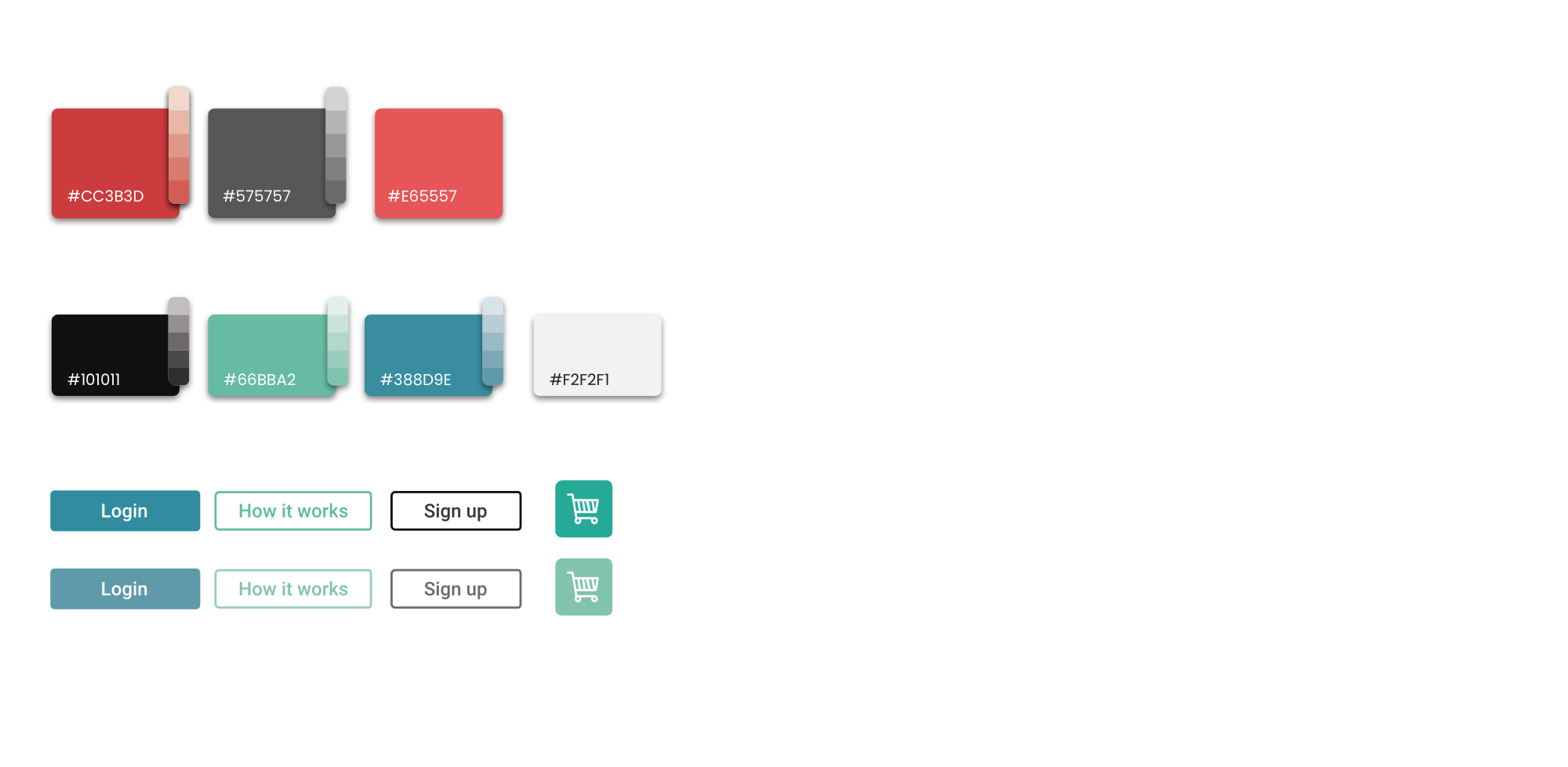
The primary colours would be used for marketing, brand and primary CTAs, whereas the secondary colours would be used for non-destructive actions.
Core Mission
Keep it simple.
Not only is this an MVP but it is also primarily for low-quantity users of the web. This dedication to minimalism accounted for feature creep and added usability benefits for the primary user.

Physical to Digital
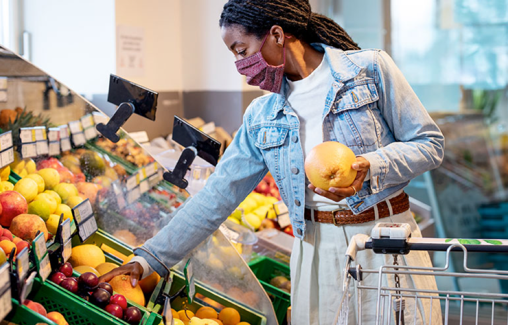
The primary UX obstacle was the database aggregating thousands of products. Unlike physical shopping, the user is presented with all options simultaneously.
Our user group wasn’t digitally literate; point & click and literal terms were the key. This platform was going to transition physical buyers into digital ones.
Predictive Search
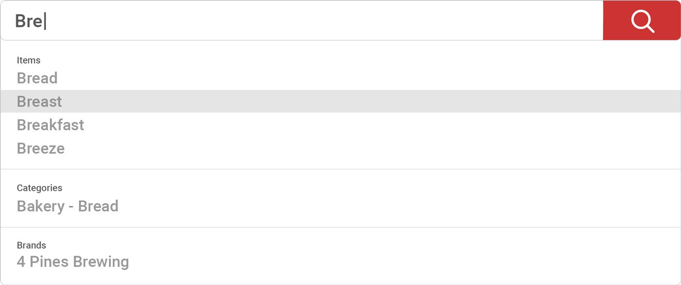
Taken for granted nowadays, a predictive search offers options the user may not have thought of and also a shortcut to what they want.
This is for users that know exactly what they want.
Facet Search
Facet search adds each search term as a parameter for successive searches.
This introduces a user-generated category – meaning they can search as they wish. This is great for users like “Restricted Diet.”


Tiered Categories
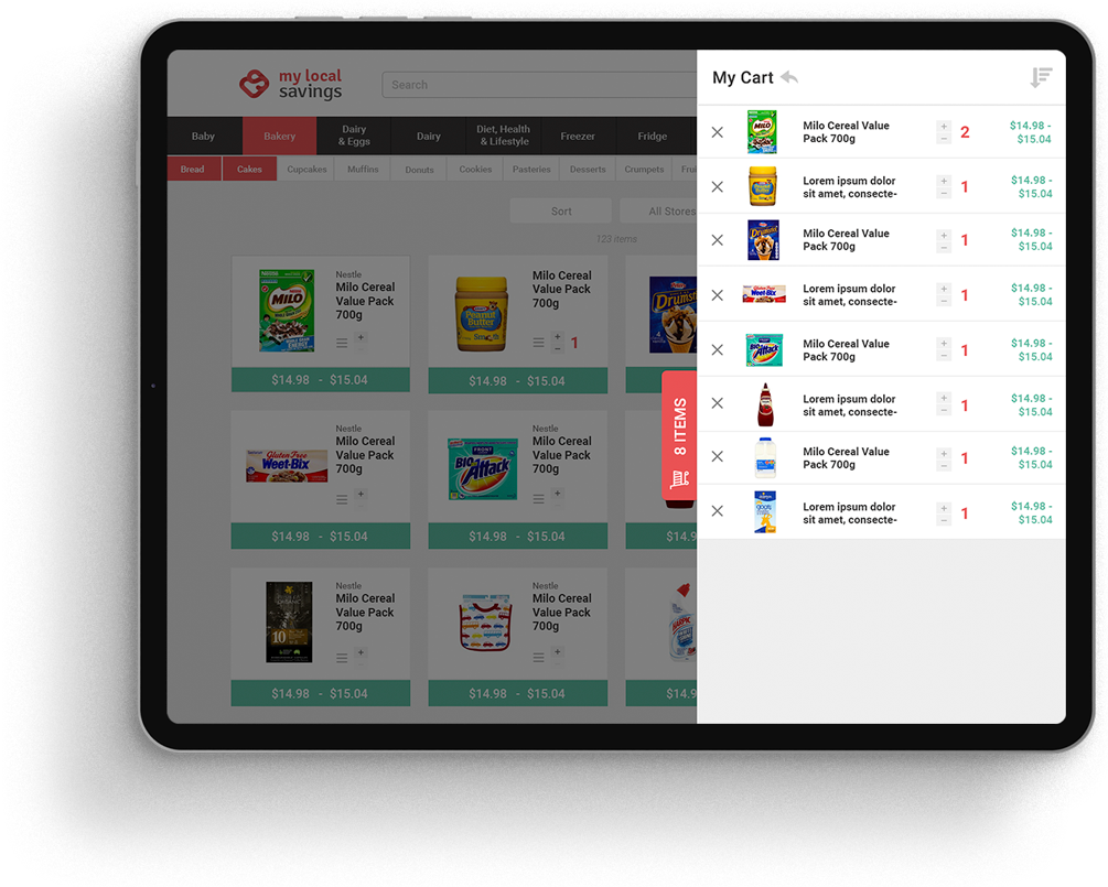
Capping the categories at 2 Tiers simplifies the navigation. The order of the categories mimics that of the physical location, and therefore the existing shopping habits.
Interface Design
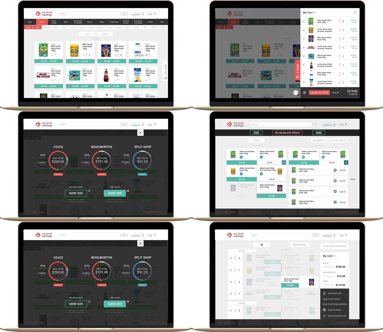
With the Online Canteen interface, we prioritised clarity and legibility – the primary use case is to be functional.
We also made the website and management areas fully responsive down to mobile, although we saw that currently it was primarily used on desktop.
“Michael initially came recommend to us. We gave him a scope of what we wanted, and what he delivered was above and beyond in terms of creativity, ease of use, and a clean modern feel. It’s fantastic! We wouldn’t hesitate in using Michael again or recommending him in the highest regard. He definitely is very talented.”
Jarred Marks – Our Online Canteen
Let's see if we click 👉
We have experience at every level and stage. Talk to us about strapping a rocket to your roadmap.
