The challenge
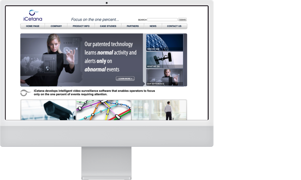
iCetana was years ahead of the competition, but their identity was dated and confusing.
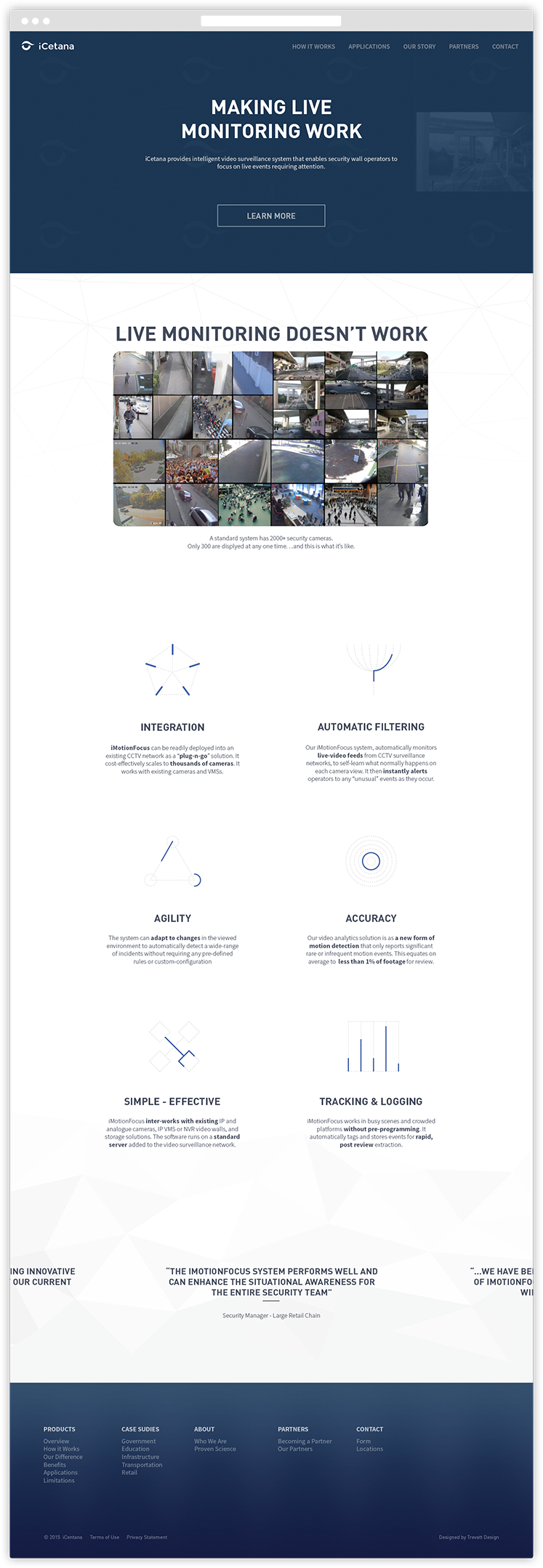
iCetana needed an updated brand and website that more accurately represented their clever use of technology without losing the social capital generated already.
Visual language
To represent the dynamic and machine-based filtering system, we created a series of visual elements to use throughout iCetanas touch-points.
Abstract fractal icons for general information, and bespoke animated icons for specific concepts. These were then animated in native HTML.
Logo Redesign
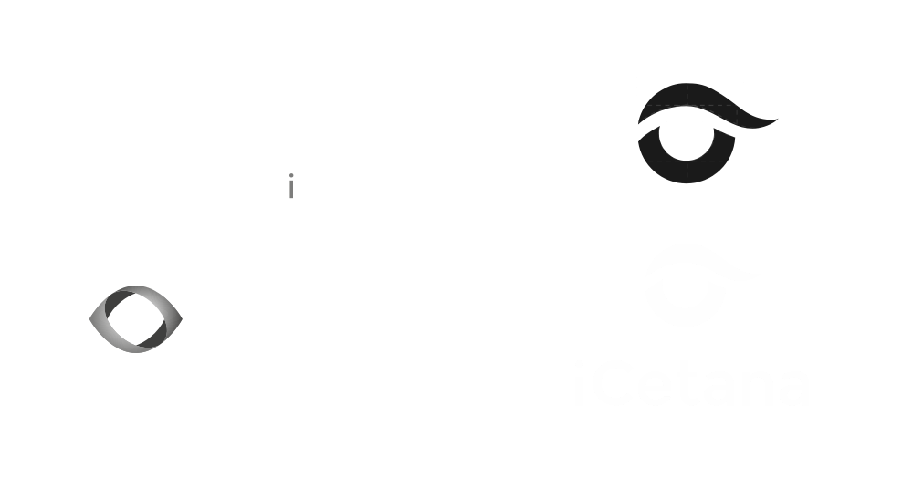
While many options were considered during the design phase, ultimately iCentana decided to preserve the capital they had generated with their current brand.
This is a common occurrence, so we simply refined the shape to be more modern and geometric, and updated to a web-safe font.
Branding
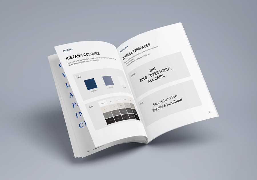
Brand elements were kept simple with a monochromatic colour scheme that allowed animation, texture and imagery to be highlighted.
Bold, simple, readable fonts were used to accentuate the brands message: simplicity.
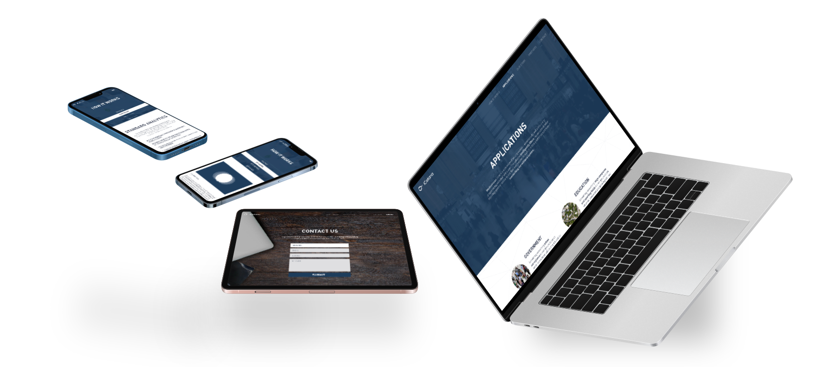
Fully responsive
The website was built on a custom CMS using the latest tech for speed and experience; fully optimised for mobile and tablet. All animations were web-native, and videos were served to the browser in the preferred format.
“I’ve worked with Michael as both a colleague and a freelance client, and he consistently impresses me. He’s very creative, professional, and always delivers beautiful and thoughtful designs.”
Alex Louden – iCetana
Let's see if we click 👉
We have experience at every level and stage. Talk to us about strapping a rocket to your roadmap.
