Outline
Deliverables
Website Audit
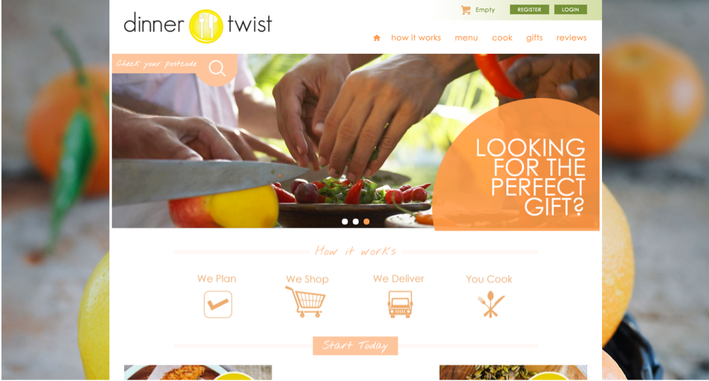
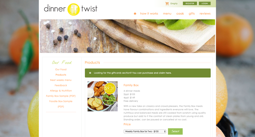
Analyse and review the existing website, content, checkout process, tone of voice. Review customer subscription process, map out touch points and retention strategy
Competitor Research
Conduct a competitor analysis to develop a market position.
Define Objectives
Research demographics and user stories to determine primary and secondary users.
Brand Development
Develop unique market, brand identity and customer acquisition / retention strategies.
Prototype & Test
Prototype several website versions focusing on click through, conversions and customer satisfaction.
A/B test prototypes to develop an optimal design.
Create a high fidelity prototype to test nuanced user experience.
Design UI
Create a high fidelity prototype to test nuanced user experience.
Map Backend
Design a high functioning back-end management system. Map the integration of dynamic content and the implementation of existing content into the new system.
Current Issues
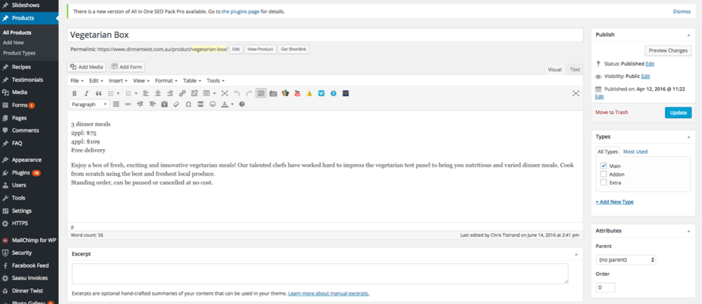
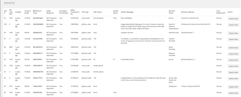
Existing CMS
- Lack of Automation
- Bloated/Irrelevant features
- Lack of customisation
- Slow load times
- Lack of integration
- Steep learning curve
- Miss-labelling (using substitute labels)
- High risk of user error
- Lack of permission levels
- Sensitive data risks
- Missing Key Operations
Competitors






Primary Competitors


Secondary Competitors



Supplementary Competitors
Playing to your strengths
Dinner Twist had a unique advantage over its competitors: It was local. Not only that but it was based in Fremantle, widely known for its fresh, farm-to-table produce.

Demographics
30 year old, female, mother/couple, working professional, renting, Caucasian, middle class, Perth resident, politically indifferent.
Psychographics
Ecologically concerned, highly open, medium altruism, nutritionally focused, life/work balance concerns. ESFJ.
Priorities
Children, work, partner, friends, immediate family, social – in that order.
Technology
IT – 40%, Software – 60%, Mobile – 80%, Social – 90%. Mobile – iPhone (Safari), Desktop – iMac (Safari)
Goals (with products)
Helpful, entertaining, motivating, aesthetic, safety, speed, reliable, and convenient.
Avoid
Poor design, unnecessary complication or control, commercialising/wholesaling, frequent contact, being too formal, lack of information or expertise.
Logo Redesign
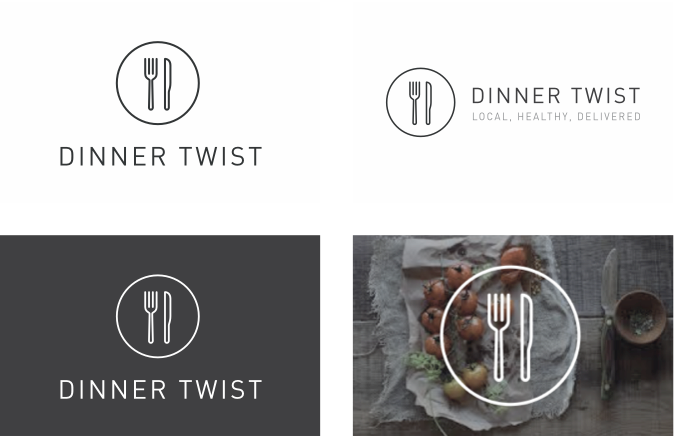
Simple, clean and elegant. Usable as a glyph overlay but also as a complex visual.
The new logo represents restaurant quality, with little fuss with a sprinkle of an innovative tech company.
Brand Guides
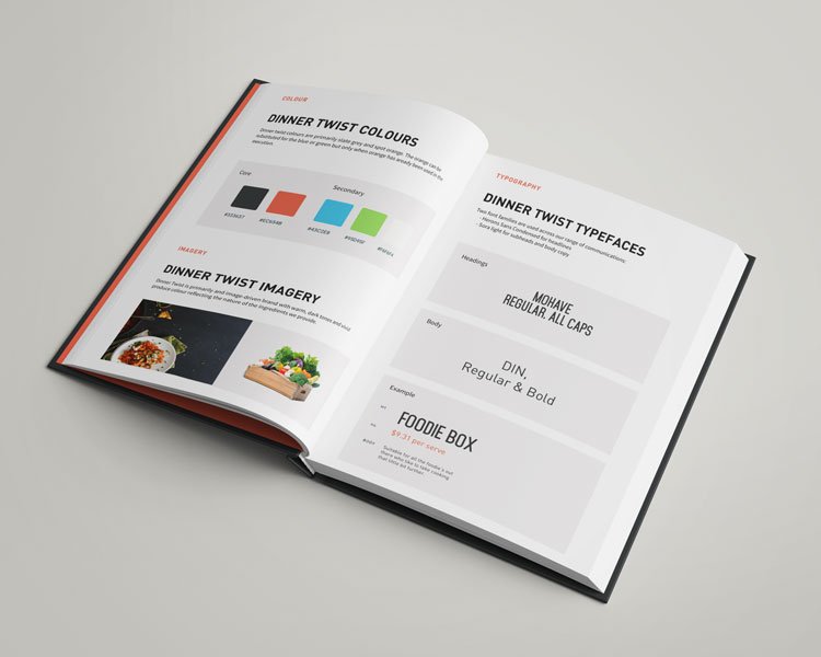
Primarily neutral colour, the brand also heavily relied on imagery and allowed for vibrant spot colours, with orange as the primary.
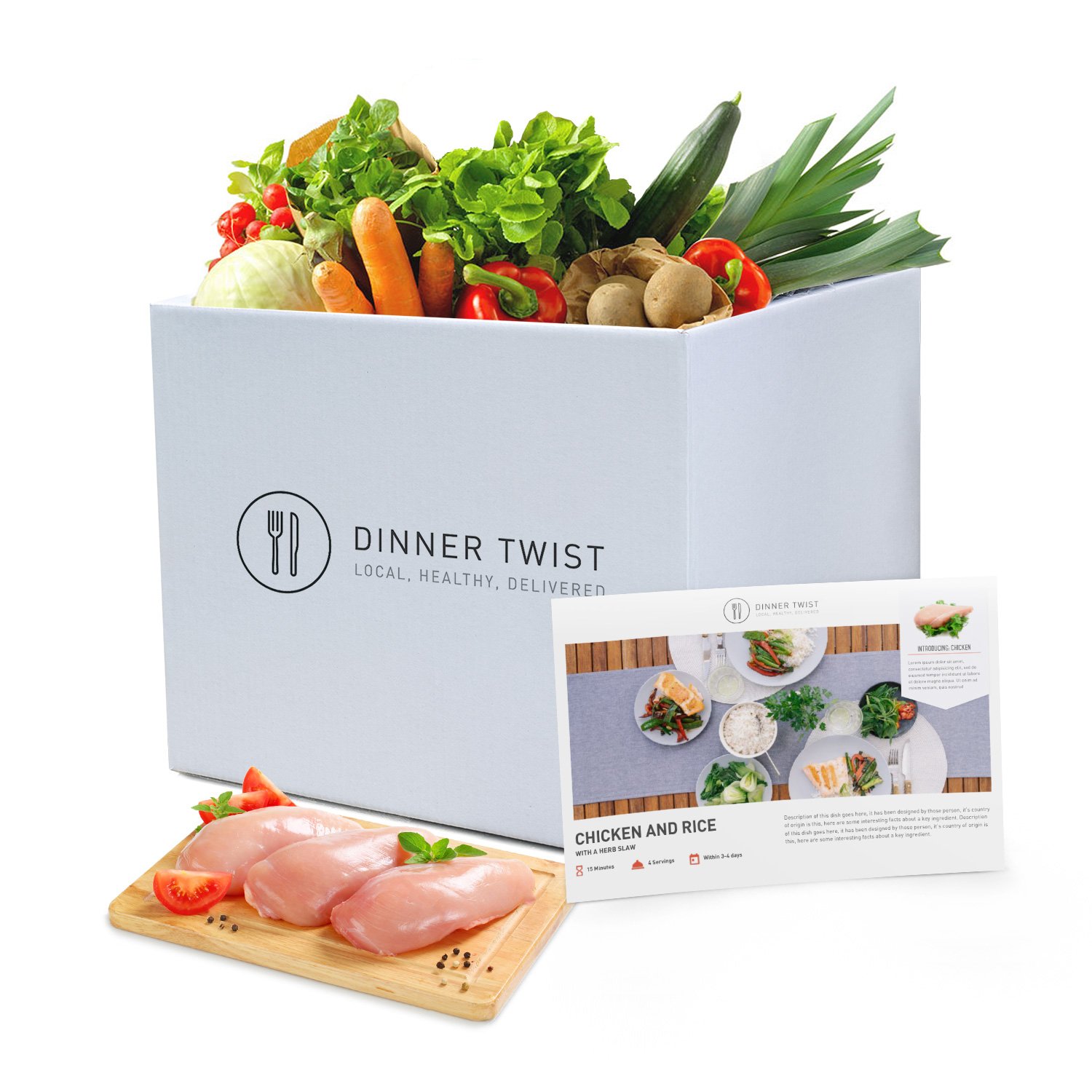
Brand in action
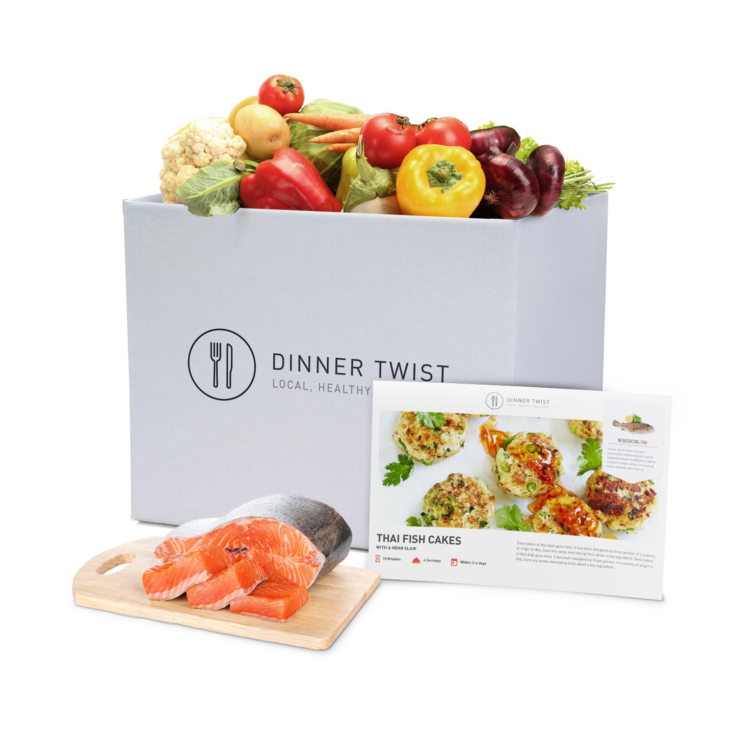
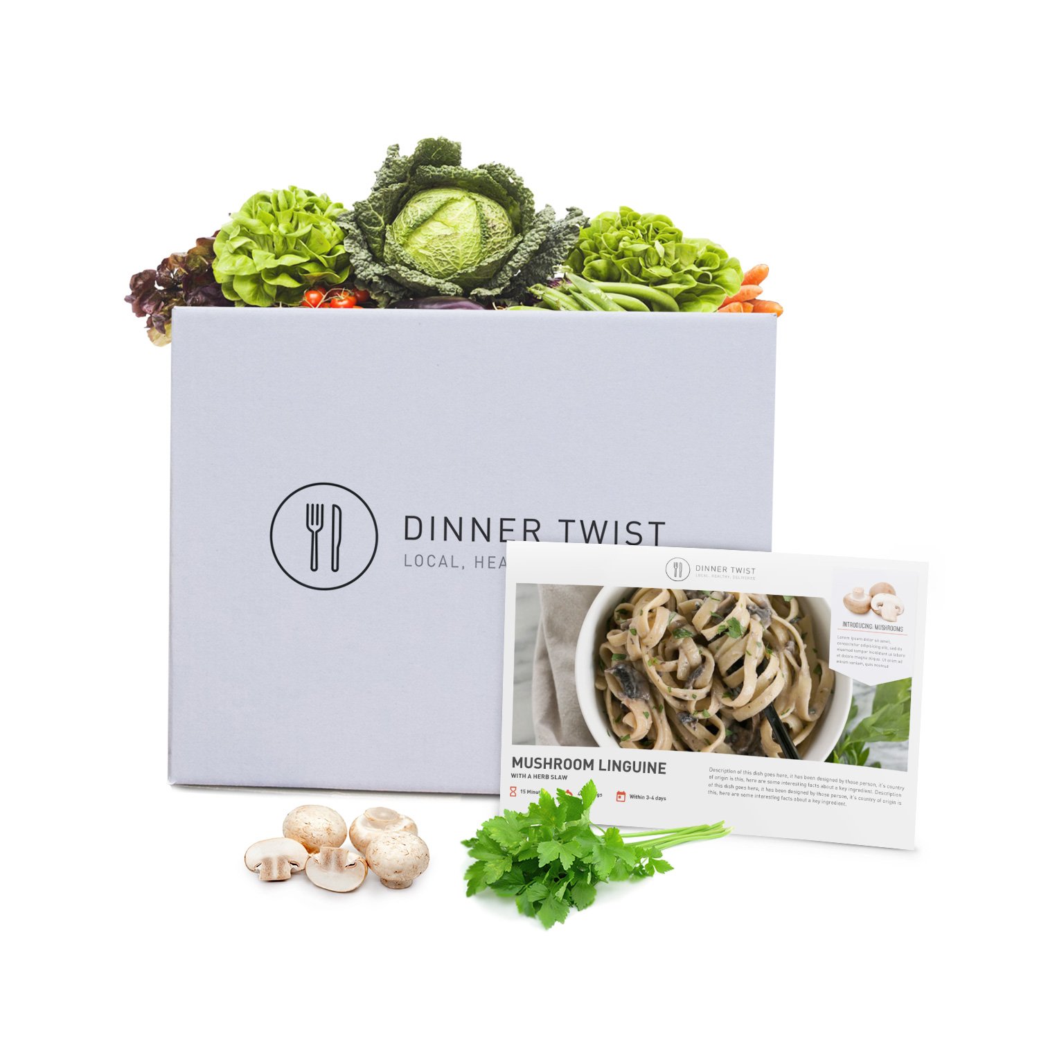
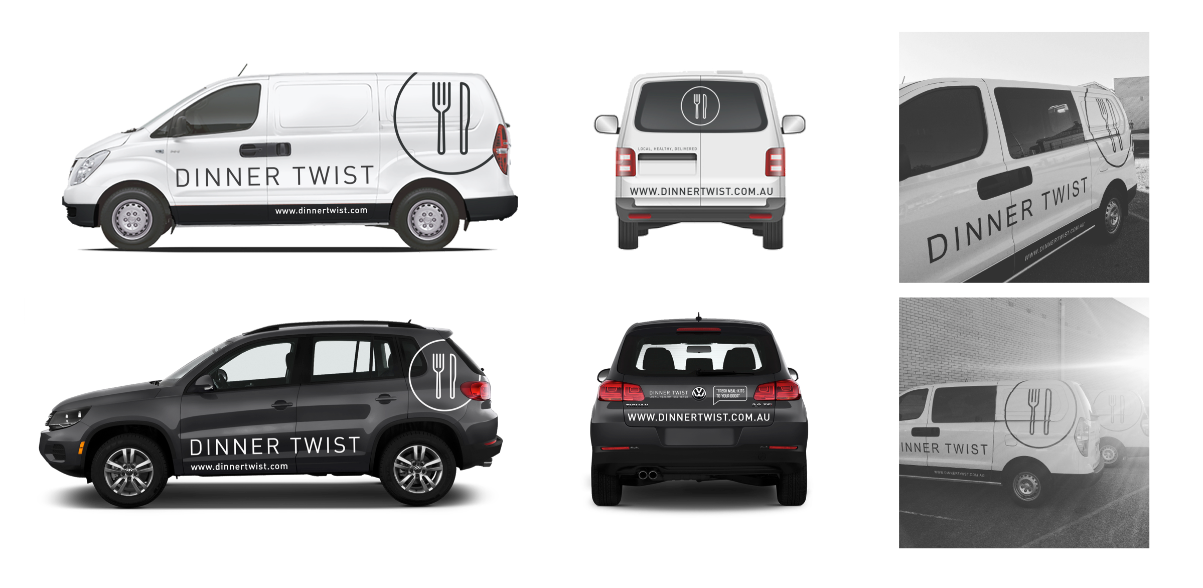
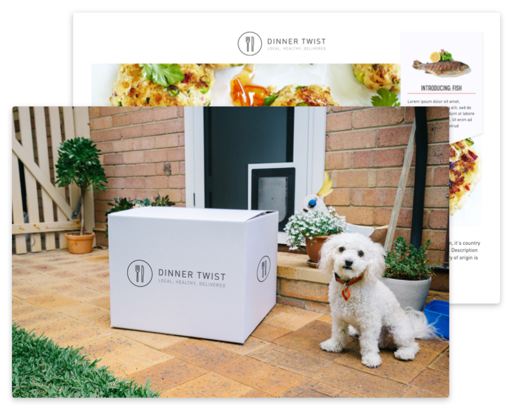
Dinner Twist’s branding extended to numerous spaces. However, importantly for the brand, they always encouraged reuse first, and recycling second. The only waste, was what the kids left on their plates.
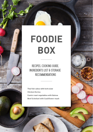
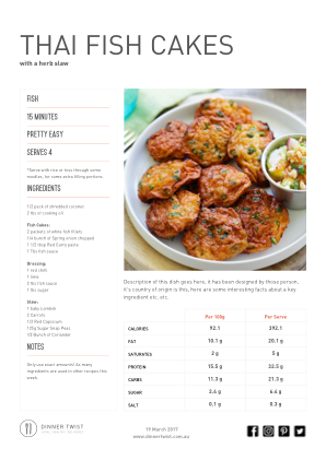
Reusable Templates
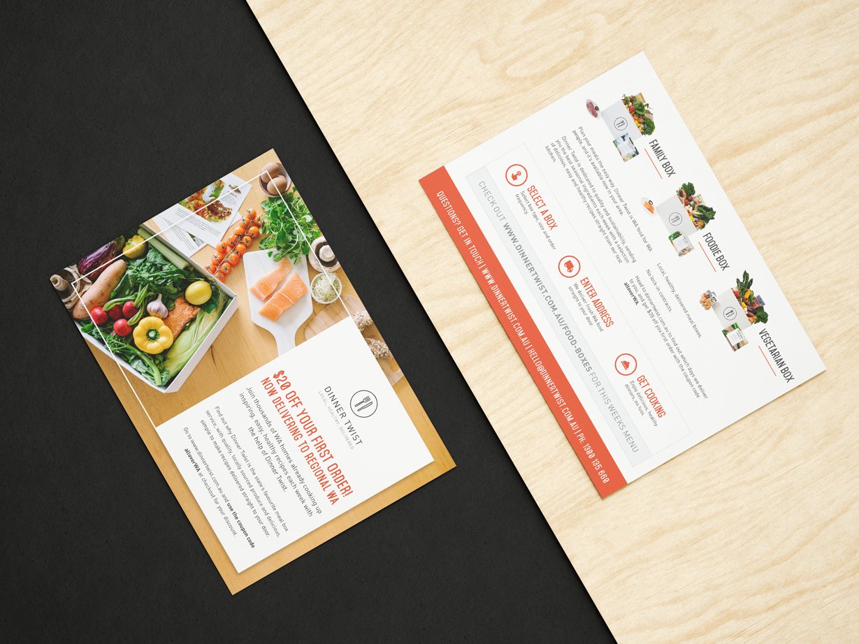
All of Dinner Twists content needed to be created in a reusable format; they opted for Apple Pages.
This could be used, and modified weekly by the staff to constantly stay connected with their customers.
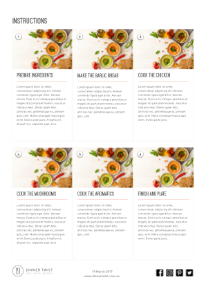
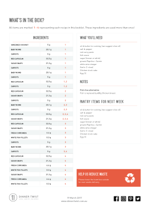
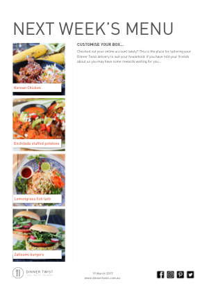
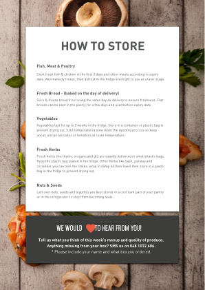
Invited home
It was imperative that the brand was aesthetically sensible and pleasing to the customer, since it will be visible in the intimate space of the home.
To be hear you have to be an extension of the customer.
Website Design
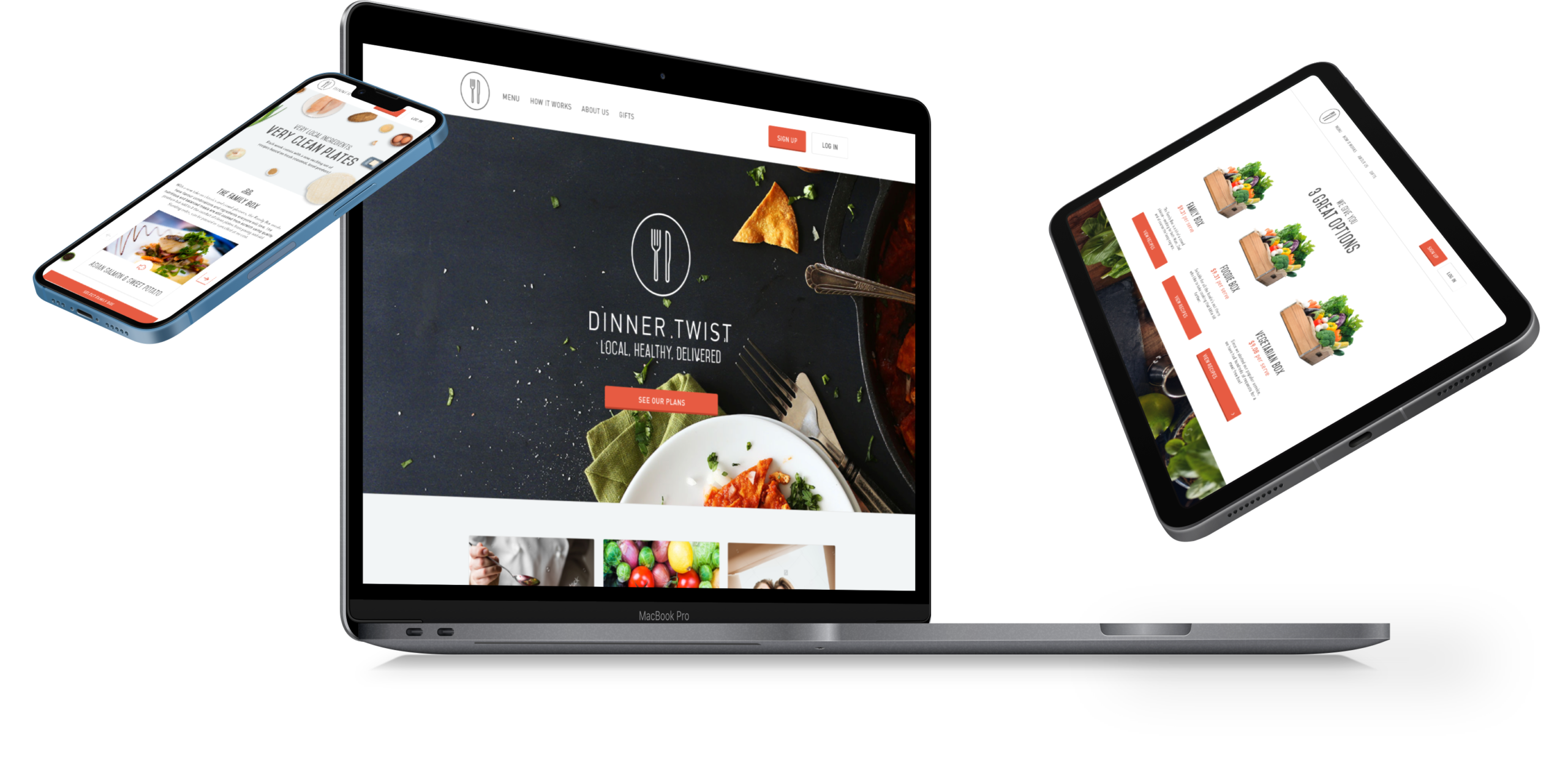
Both the front and backend of the website were redesigned. Fully responsive, the design was clean, and accessible with a focus on clarity in both visuals and message.
Design Goals (User-Facing Website)
- Simplify & streamline checkout.
- Convey brand values and USPs.
- Convey the service and value proposition.
- Make use of dynamic content in multi-platform touchpoints.
- Make content shareable and recommendable.
- Design a simple website that avoids purchase barriers.
Content Mapping
Dinner Twist would now offer three models:
- Weekly Subscription
- On-Demand
- One-off Orders
- Family Box
- Vegetarian Box
- Foodie Box
- Add-ons such as fruit & toiletries
Also offering retention options:
- Gift Cards
- Gift Boxes
- Referral Discounts
- Loyalty Program
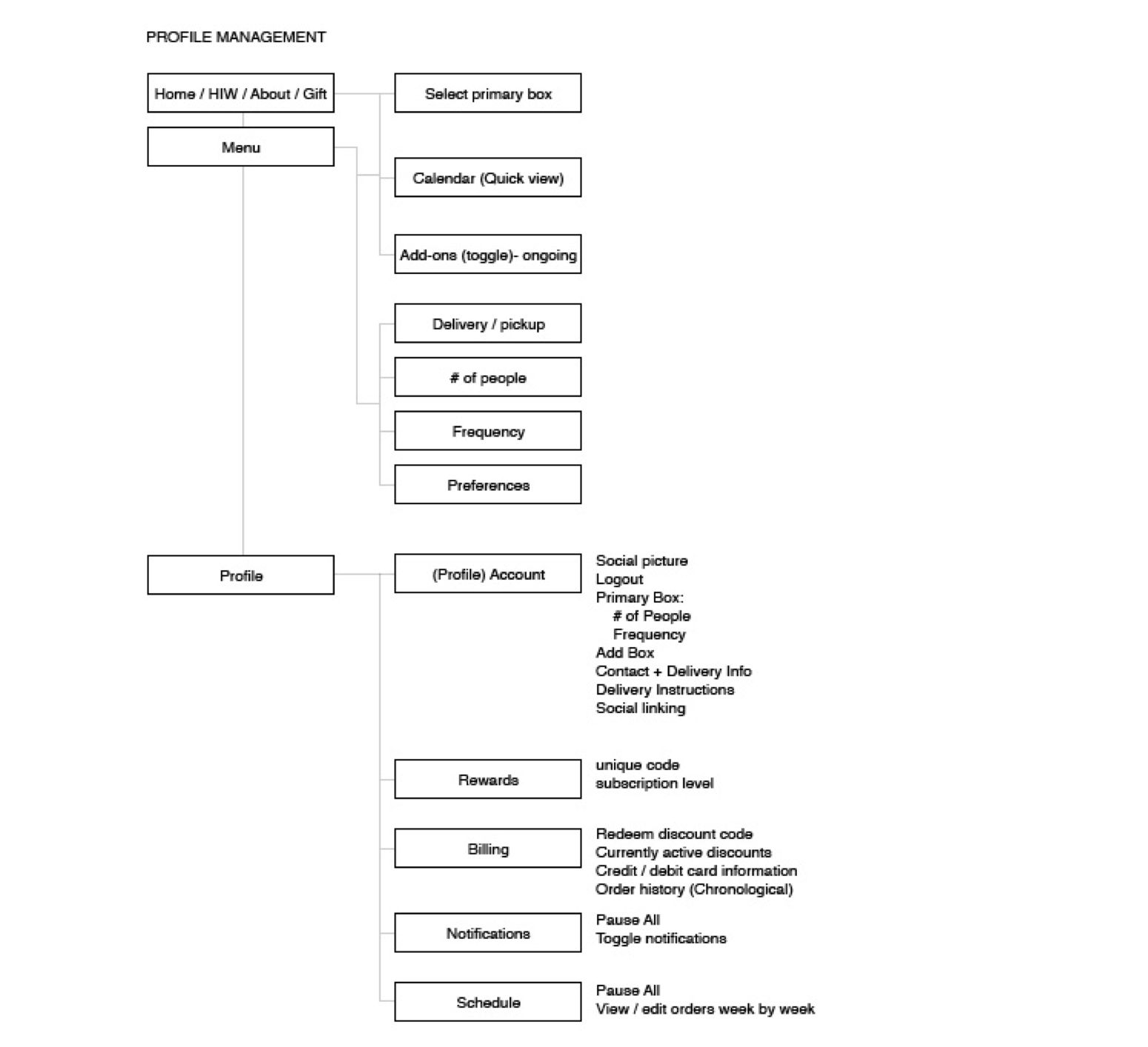
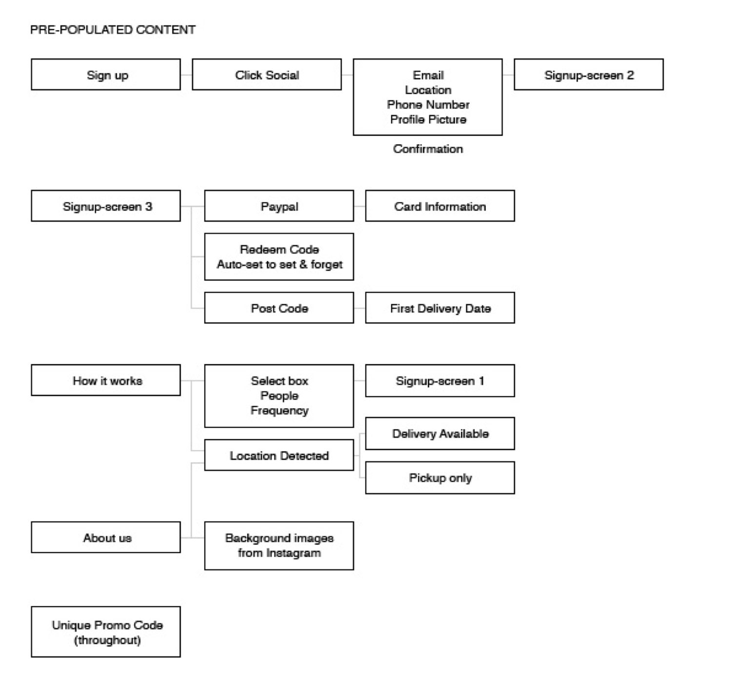
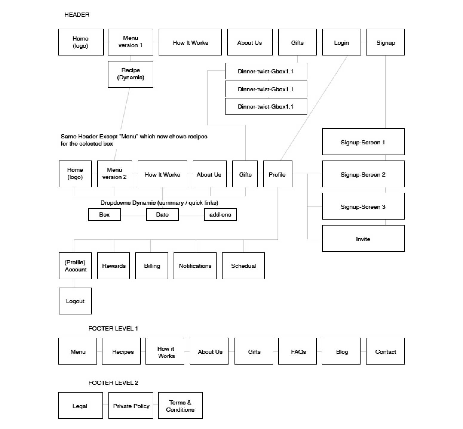
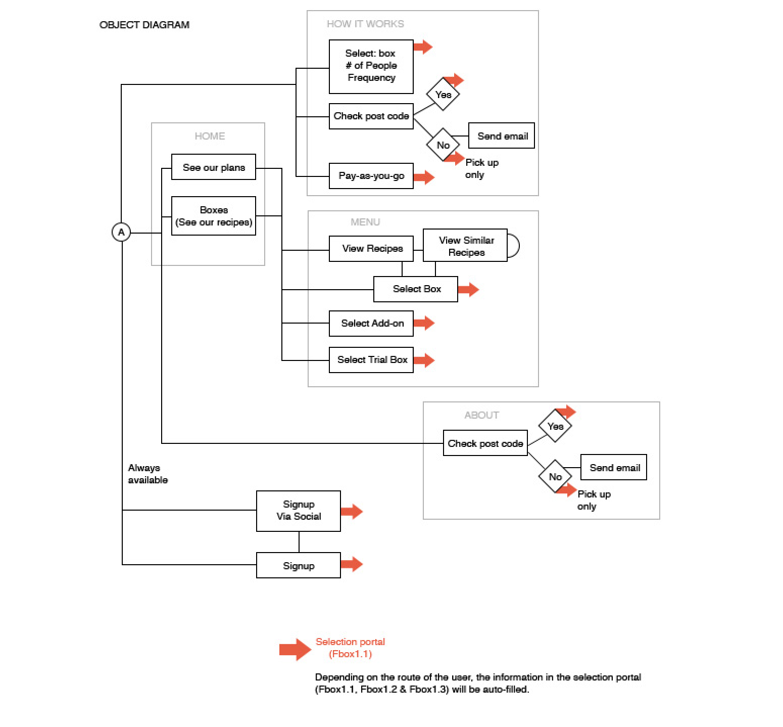
User flow and IA
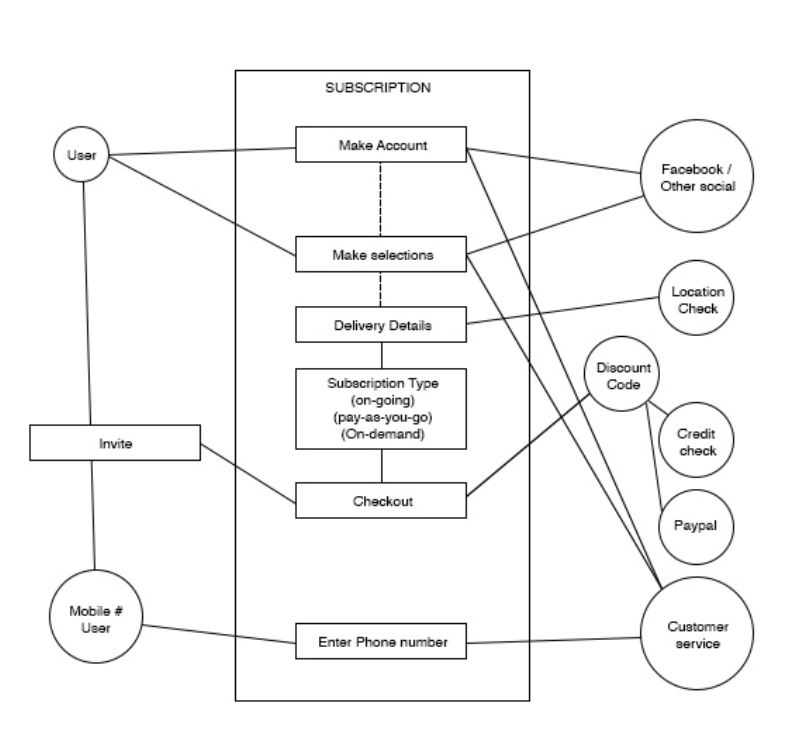
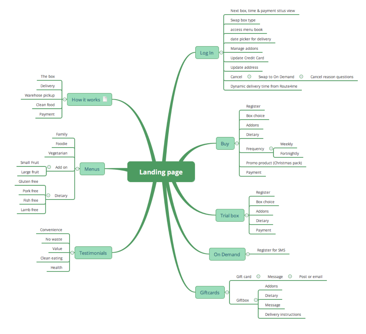
Dinner Twist had a very niche user base, so the website could be highly tailored to their preferences and habits. Acknowledging that you usually only get one chance to acquire a new customer, we structured the content to account for different states of mind.
i.e. Passing glance, passive curiosity, goal-oriented, inquisitive, sceptical.
Conversion
The way the user engages with the brand is very important. How they react can often be predetermined by their mindset before coming to the website. We attempted to not only account for this, but also influence it.
“Passing Glance”
Time-poor, low trust, indifferent to outcomes.
Response
Large, high-quality, engaging imagery. Interesting parallax effects, human faces & testimonials.
“Passive Curiosity”
Time-rich user, medium expectations, indecisive.
Response
Rich engaging content, simple value propositions, flexible options.
“Goal Oriented”
Time-poor, high expectations, decisive, impatient, motivated.
Response
Checkout from landing page (above fold), auto- populated checkout, 3 step process.
“Inquisitive”
Time-rich, medium expectations, positive mindset.
Response
Testimonials, about us page, recipes and Chefs section, positive tone of voice.
“Sceptical”
Time-rich, very high expectations, negative mindset.
Response
Flexible options, suppliers section, quality description $per meal breakdown.
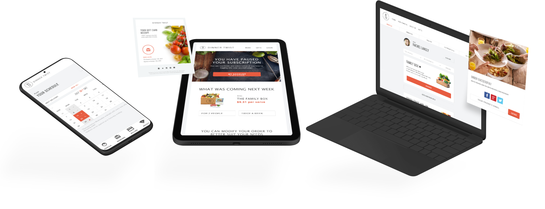
User Retention
- Retention emails
- Preview of other box subscriptions
- Optimised mobile user interface
- Share & rewards program
- Push notifications – with opt-out
- Clear scheduling with calendar view, with the option to pause individual weeks
- Simple linear navigation
- Uncluttered and clear content structure
- Up-sell placed next to edit state with 1 click add.
- Pause instead of cancelling
- Dynamic preview of next week’s recipes with
- Instructional videos by celebrity chefs
- Dietary preferences settings
- Simple billing breakdown with tax summary PDF
- Competition announcements and prompts for social
Management Dashboard
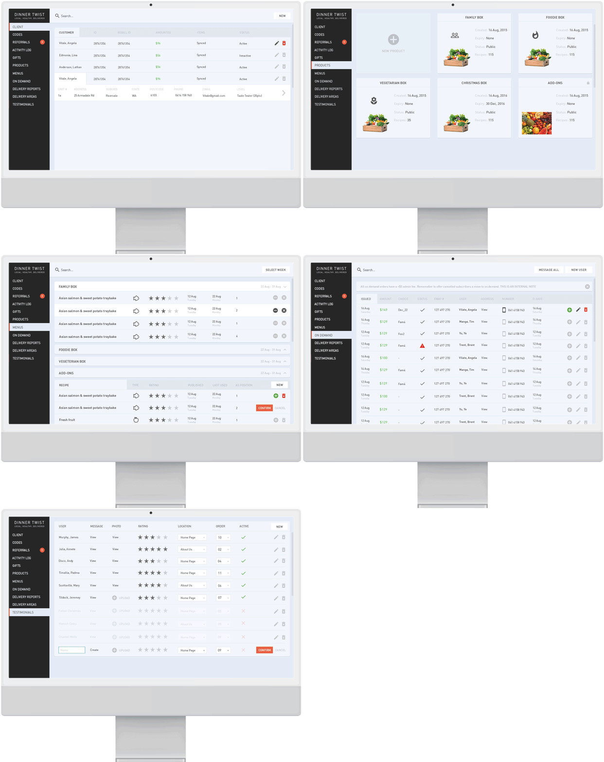
The dashboard mimicked WordPress to decrease the learning curve. But the navigation and content structure was tailored specifically for their processes.
- A consistent search and filtering system across each relevant section.
- A modular recipe/box pairing system.
- New permissions and accountability for change management.
- A secure third-party manager for sensitive information.
- Automation for order management and processing to the warehouse.
Final Outcome
The market, internationally, has become saturated, but Perth’s Dinner Twist has the advantage of being local and the first mover.
The website launched with huge success: they have retained their customer base with the capacity to scale.
We feel that the anti-chain and local approach will resonate with people going forward.
“Michael is hands down, one of the most impressive design professionals I have ever worked with. His approach is grounded in logic, data and problem-solving and works relentlessly to get under the skin of the customer to ensure that his solution is the best possible.”
Holly Dawson
Let's see if we click 👉
We have experience at every level and stage. Talk to us about strapping a rocket to your roadmap.


