The UX design process gets talked about a lot in theory. Empathise, define, ideate, prototype, test. Five neat steps in a diamond shape. Very tidy.
In practice, it’s messier than that. Projects have budgets. Clients have opinions. Users do unexpected things. The real skill isn’t following the framework. It’s knowing when to adapt it.
Here’s how UX design actually works when you’re building real products for real businesses.

1. Discovery and research
Every project starts with questions. Who are we designing for? What problem are we solving? What does success look like? What already exists and why isn’t it working?
This phase involves talking to stakeholders, reviewing analytics (if available), looking at competitors, and understanding the business context. If there are existing users, we talk to them too.
The goal isn’t to produce a 60-page research document. The goal is to understand the problem well enough to make good design decisions. Sometimes that takes a week. Sometimes it takes a day. The depth of research should match the complexity and risk of the project.
What you get out of this: a clear understanding of who the users are, what they need, what the business needs, and where the gaps are.
2. Information architecture
Before anyone opens a design tool, we need to work out the structure. What pages does the site need? How do they relate to each other? What’s the hierarchy?
Information architecture is the skeleton of the product. Get it wrong and no amount of visual polish will fix the confusion.
This usually involves sitemaps, content audits (if it’s a redesign), and card sorting or tree testing if the structure is complex enough to warrant it.
For simpler projects, this might be a 30-minute conversation and a quick sitemap sketch. For complex platforms, it can take weeks.
3. Wireframing
Wireframes are the blueprint. They show layout, content hierarchy, and user flow without the distraction of colours, fonts, and images.
I use wireframes to get alignment on structure before investing time in visual design. It’s much cheaper to move a box on a wireframe than to redesign a fully styled page because the layout doesn’t work.
Wireframes should be rough enough that nobody mistakes them for the final design, but detailed enough that you can see how the page will function. The sweet spot is somewhere between a napkin sketch and a polished mockup.

Clients sometimes want to skip wireframes and go straight to "the real design." I push back on that. It’s like asking a builder to skip the architectural drawings and just start laying bricks. You can do it, but you’ll spend more time and money fixing problems later.
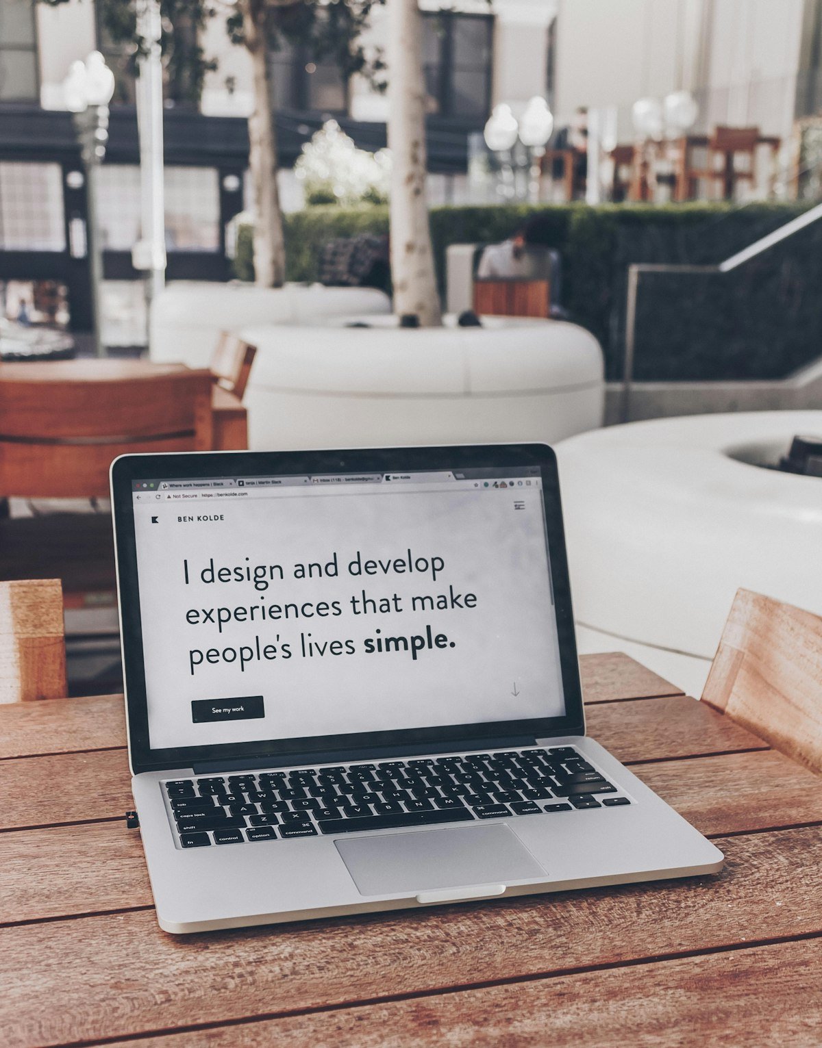
4. Visual design
This is where the thing starts to look like a real product. Typography, colour, imagery, spacing, motion. All the visual decisions that shape how the product feels.
Good visual design isn’t about making things look pretty. It’s about making information clear, actions obvious, and the experience feel appropriate for the audience. A fintech app and a children’s learning platform need very different visual approaches, even if the underlying UX patterns are similar.
I design in the browser or in Figma, depending on the project. The key is that every visual decision should have a reason behind it. If you can’t explain why something is that colour or that size, it’s decoration, not design.
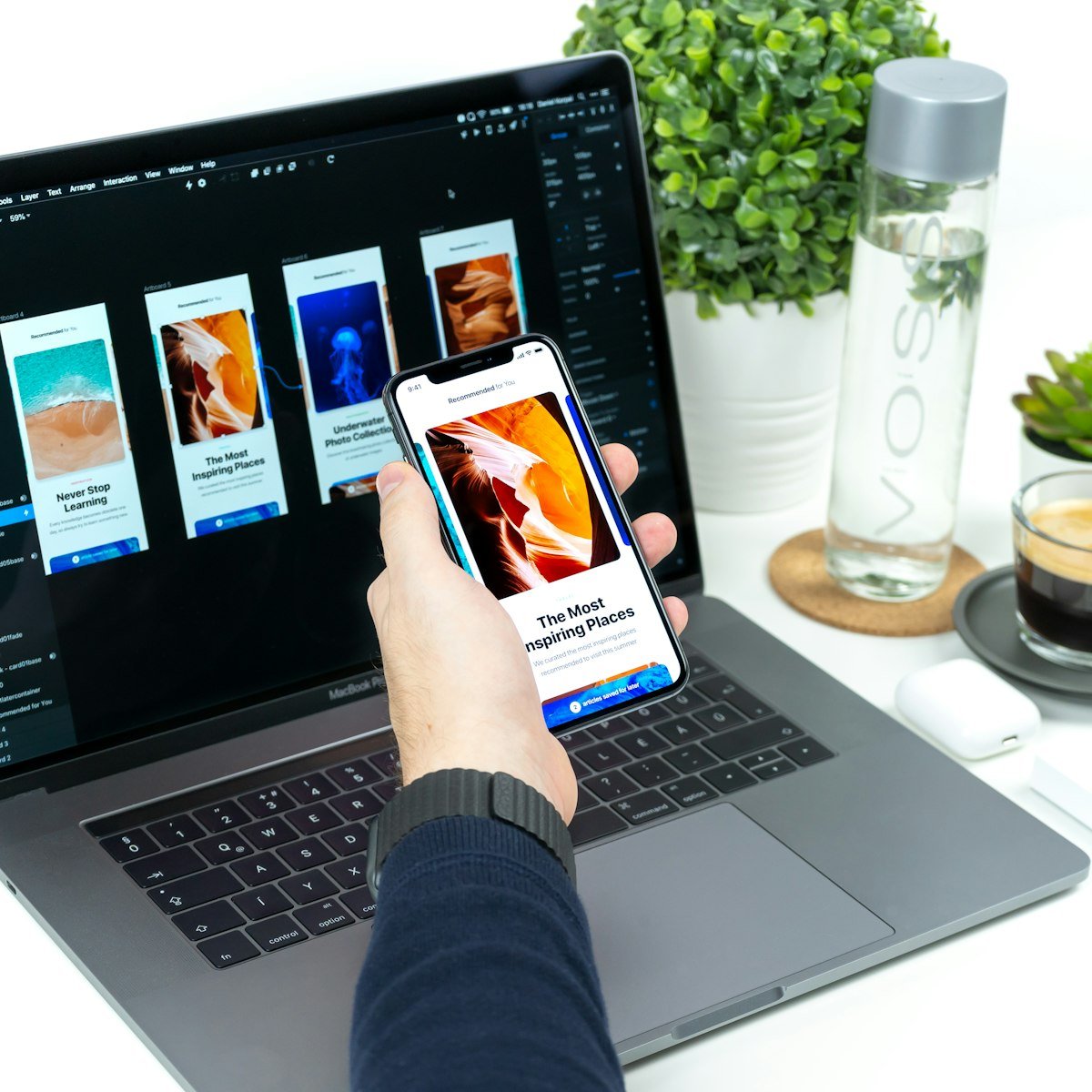
5. Prototyping
A prototype is a clickable version of the design that lets you test the experience before building it. You can test navigation flows, form interactions, and key user journeys without writing a line of production code.
The fidelity of the prototype depends on what you’re testing. Testing whether users can find the checkout button? A simple clickable prototype is fine. Testing whether a complex configuration tool feels intuitive? You might need something more interactive.
Prototyping catches problems early. I’ve seen entire features scrapped at the prototype stage because user testing revealed that the concept didn’t work. That’s a good outcome. Better to learn that before development starts than after launch.
6. User testing
You can make assumptions about how people will use your product, or you can watch them actually use it. I’d recommend the second option.
User testing doesn’t need to be expensive or complicated. Five users testing a prototype for 20 minutes each will uncover most of the major usability issues. You don’t need a lab, a one-way mirror, or a sample size of 200.
What matters is that you’re testing with people who match your actual audience. And that you’re watching what they do, not just listening to what they say. People will tell you a design is "nice" and then struggle to complete a basic task. Their behaviour is the truth.

7. Iteration
Testing reveals problems. Iteration fixes them. Then you test again.
This is the part of the process that gets squeezed when budgets are tight. But it’s where the quality comes from. First drafts are never the best version. The difference between a good product and a great one is usually two or three rounds of refinement based on real feedback.
8. Development handoff
Designers and developers need to communicate clearly. That means detailed specifications, annotated designs, a shared understanding of responsive behaviour, and an accessible design system or component library if the project is large enough.
The worst outcomes happen when a designer throws a static image over the wall and expects the developer to figure out every edge case. The best outcomes happen when designers and developers work together throughout the process.
9. Launch and learn
Launching is not the end. It’s the first time your product meets the full audience. Analytics, heatmaps, user feedback, and support tickets will all tell you things that research and testing couldn’t.
The best products are the ones that keep improving after launch. Build a feedback loop. Review the data. Make changes. Repeat.
Common mistakes
Skipping research because "we already know our users." You don’t. Or at least, you don’t know them as well as you think. Even a small amount of research will challenge assumptions.
Designing for stakeholders instead of users. The CEO’s favourite colour is not a UX decision. Internal politics should not drive information architecture.
Treating UX as a phase rather than a mindset. UX isn’t something you do once and tick off. It’s a way of thinking about every decision throughout the project.
Over-designing. Adding features, content, and interactions because you can, not because users need them. Simplicity is harder to achieve than complexity, and it almost always performs better.
How we approach it
At Trevatt Design, UX is the foundation of everything we build. The process adapts to the project: a startup MVP gets a leaner version than a platform redesign. But the principles stay the same. Understand the problem. Design for the user. Test. Refine.
If you want to see how this looks in practice, have a look at our services or start a conversation.