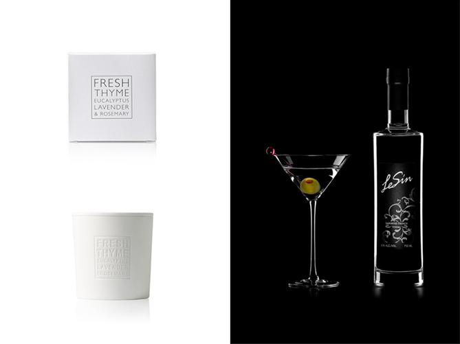
Two of my absolute favourite design styles are white on white and black on black (see examples above). The reason I like them so much is because they appear (to me) to be timeless. It gives the product a classy feel, like it’s been overtly considered. You could argue that these aren’t design styles necessarily, and your be right, but there are some things we can learn from it.
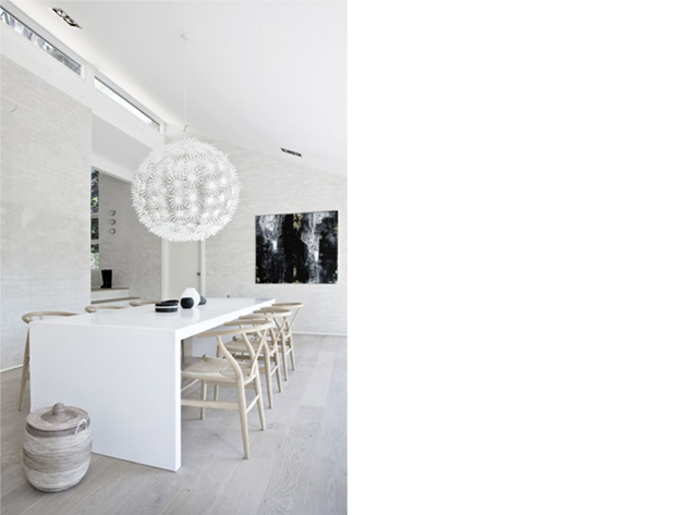
The idea of white on white came from interior design. The designers would layer different textures of white material in a single space creating a room that was subtle but full of depth. Very different feels can be created from tiny accents. In the first example below you can see the textures are organic with wicker furniture and white wash boards. The single heavy black painting draws your eyes to the back of the room opening it up.
The second example uses two cool spot colours to accent key areas. The whites are crisp and polished. The aqua and blue give a predominantly clinical room a kitsch spin.

Quiet Your Design
Why is a graphic designer talking about interior architecture? Well if you’ve ever heard of Bauhaus or the Gestalt Principles you know that design both influences and is influenced by other disciplines.
By removing colour (and the majority of harsh tonal variations) you emphasis other elements that are more commonly overshadowed.
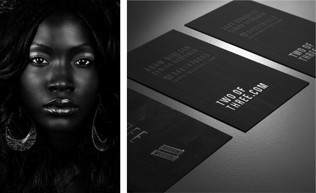
Consider the two images below. The portrait photograph is centered, symmetrical and framed by the negative space of the hair. However the main light is offset to the left, creating asymmetrical shapes. Notice the texture of each surface feels dramatically different.
Now look at the business cards below and try to describe it differently from above.
Contrast is a Designers Best Friend
Coming from an illustration background I always find myself saying “if it doesn’t work first in black and white, then it won’t work.” This is a useful trick digital illustrators do: desaturated a painting, correct the light / tones of the image and then re-introduce the colours.
Although this may not be viable for most graphic design situations, the principle still applies. What happens to your design when you remove a particularly prominent element? What happens when you remove texture, or typography, or tone etc.
Try if for yourself. It can be a very revealing process. For now I leave you with Braun’s weather App. Although it’s skeuomorphic it’s still one of my favorite white on white designs.